# Paradigm — Style Reference
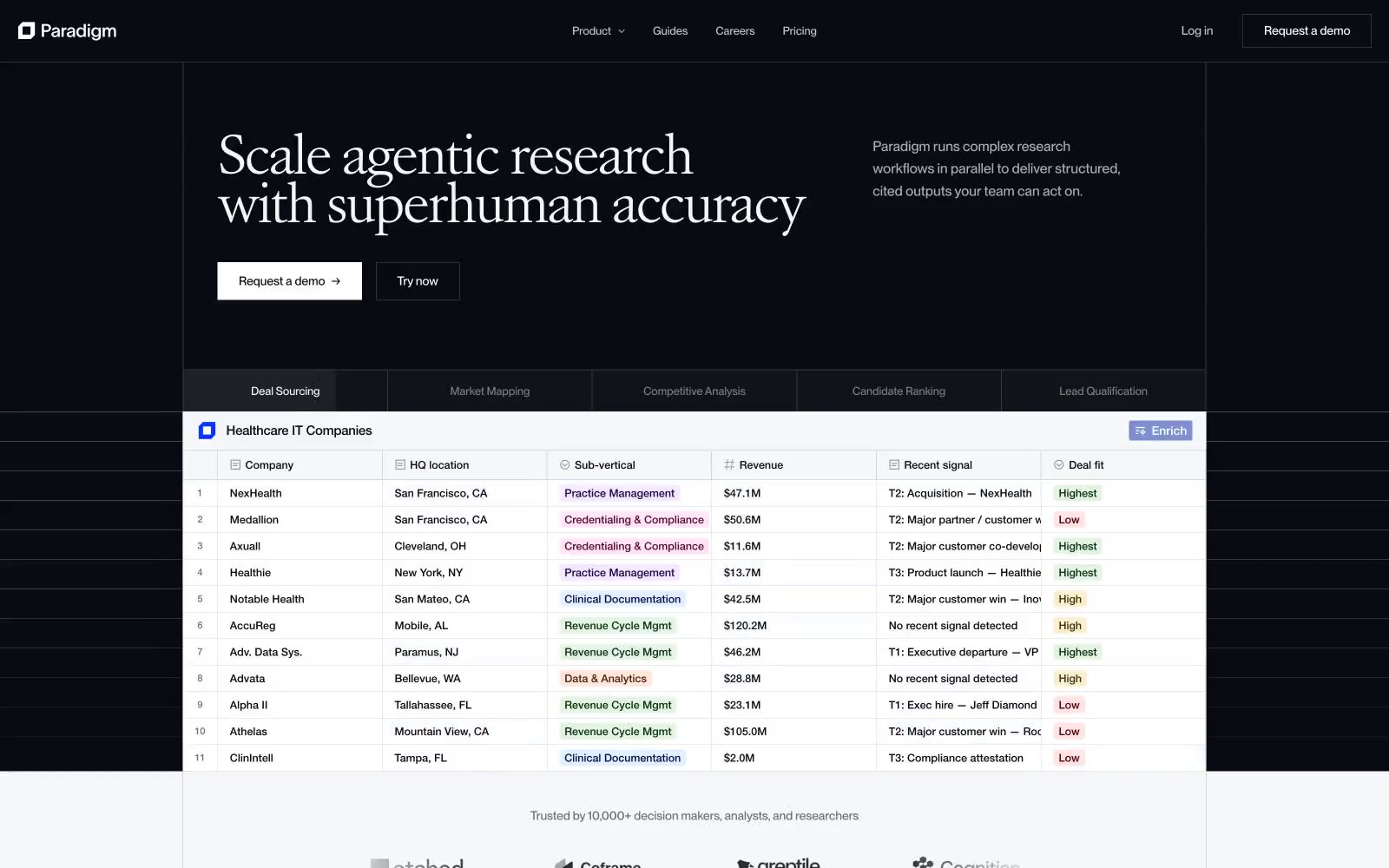
> midnight lab notebook opening to daylight — a dark first screen cracks into a bright, data-rich scroll.

**Theme:** light

Source measurements are normalized; roles and recommendations are interpreted. Font summary lists are independent, not paired by position. HTML examples are reconstructions, not source components.

Paradigm opens in a dark observatory atmosphere — near-black canvas, white serif display type, and a live data table that already proves the product — then dissolves into a daylight research interface of white paper, soft tinted surfaces, and pastel status badges. The signature move is the Atacama VAR serif at 44–54px with -0.06em tracking, paired against a workhorse PP Neue Montreal that carries the entire UI at 14–22px with tabular numerals. Color is rationed: one vivid blue (#0a33ff) punctuates the brand through active states and step indicators, status is communicated through six dark-ink + pastel-wash badge pairs (forest, sapphire, mulberry, amber, crimson, plum), and the rest of the system lives in carefully tuned warm and cool grays. Components feel like research instruments — 4px corners, hairline borders, a signature white inner-glow on product mockup cards, and almost no drop shadows.