# Alpine Hearing Protection — Style Reference
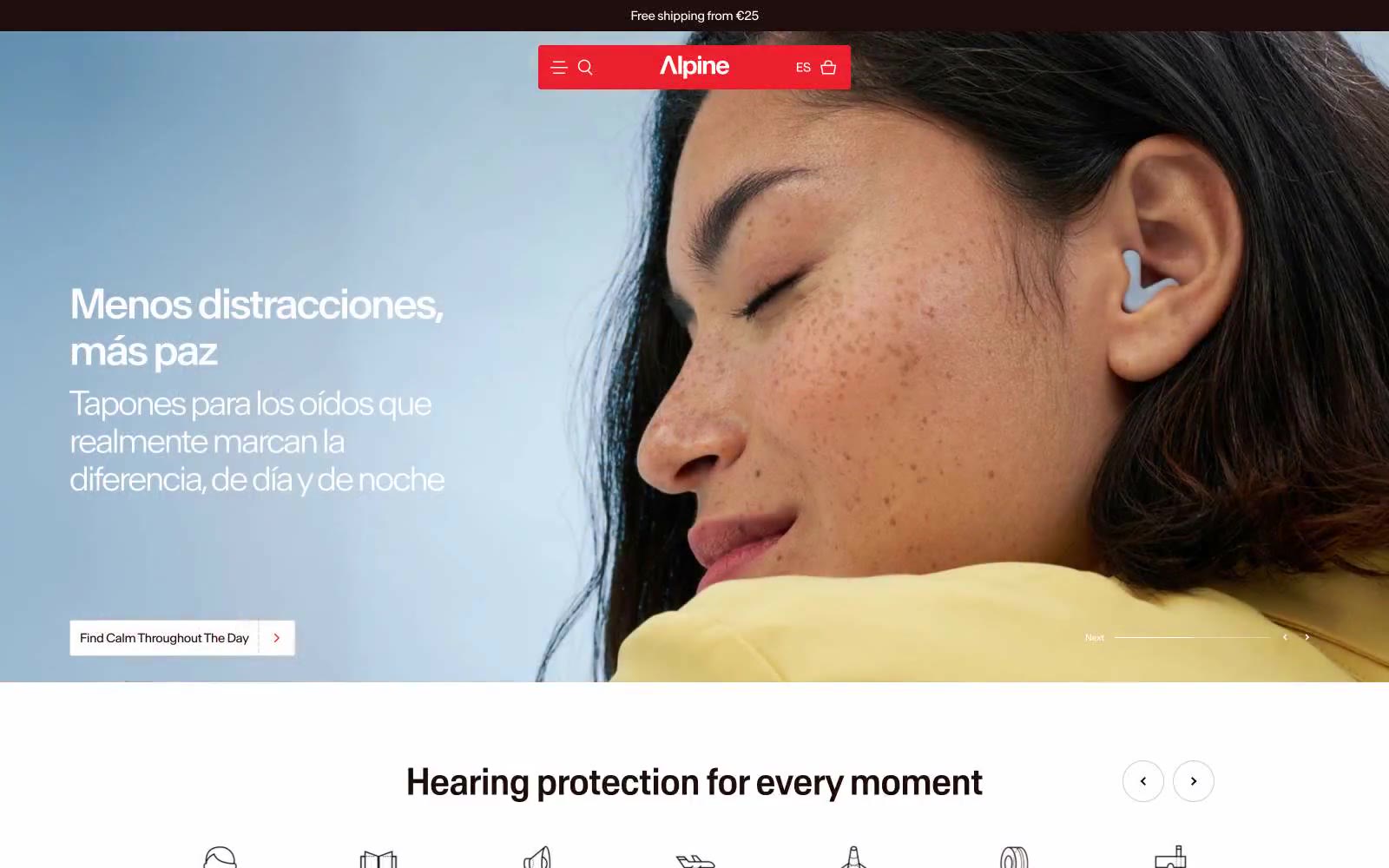
> Sunlit Scandinavian editorial. A cinnamon-ink wordmark on warm cream paper, with one red exclamation — the rest is photography and generous whitespace.

**Theme:** light

Source measurements are normalized; roles and recommendations are interpreted. Font summary lists are independent, not paired by position. HTML examples are reconstructions, not source components.

Alpine uses a warm Scandinavian-editorial language: an off-white canvas bathed in cinnamon undertones, a near-black cocoa ink for text, and a single electric red accent that appears only in the brand bar and product badges. The system feels like a print magazine spread — generous full-bleed photography sits next to tight, sharp-cornered product cards with minimal rounding (2.23px) and no decorative elevation. Typography is custom and slightly compressed (Antarctica), pulling headlines close for editorial tension. Warm cream surfaces (#f8f0ec, #f3e7e2, #fde3d6) layer underneath product imagery like a gallery wall. The visual mood is calm, premium, and tactile — photography does the emotional work while UI components stay near-flat and information-dense. Red is rationed: a logo bar, a badge, a guarantee bar — never buttons. The only filled action color is the warm cocoa (#200e0e), which replaces what most sites would use as black.