# Hey Low — Style Reference
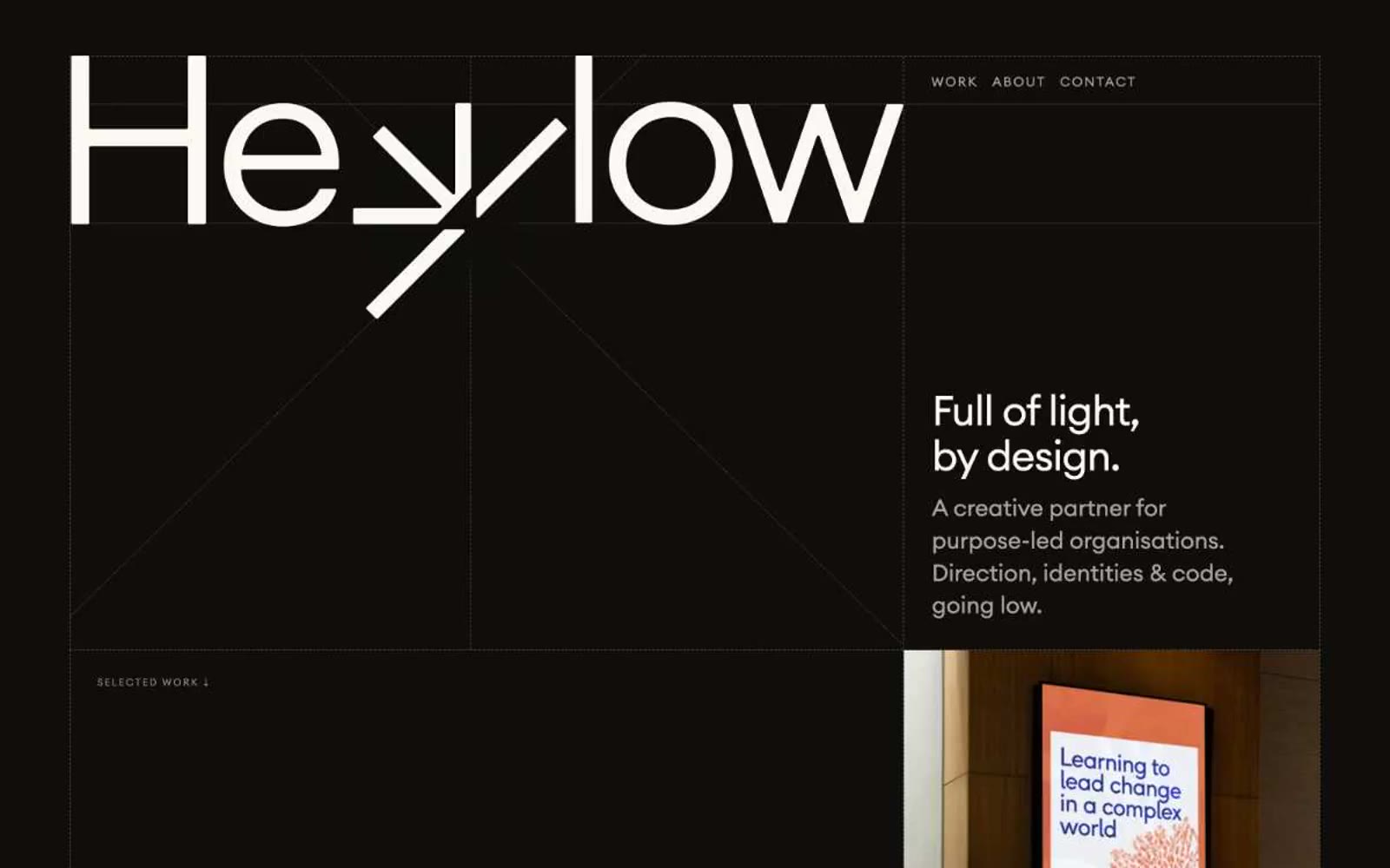
> botanical field journal on cream paper — Measured, organic, and mostly silent, with one lime-green note singing on the page.

**Theme:** light

Source measurements are normalized; roles and recommendations are interpreted. Font summary lists are independent, not paired by position. HTML examples are reconstructions, not source components.

Hey Low is an ecological field journal rendered as a website: white paper, forest-ink typography, and a single sprig of chartreuse that makes actions feel alive. The composition is generous and unhurried — most of the canvas stays quiet and near-white, with dark evergreen as the structural color and pale lime appearing only where a system needs to pulse. Headlines are set in a tight, geometric sans with aggressive negative tracking at large sizes, then punctuated by a hand-set italic serif accent that injects warmth into otherwise clinical copy. Cards, buttons, and project tiles are flat and low-elevation; visual weight comes from type contrast and illustration, not shadows or gradients. Everything should feel like a studio that designs for the planet — restrained, botanical, and deliberately spare.