# Blok — Style Reference
> Swiss showroom on teal-tinted paper

**Theme:** mixed

Source measurements are normalized; roles and recommendations are interpreted. Font summary lists are independent, not paired by position. HTML examples are reconstructions, not source components.

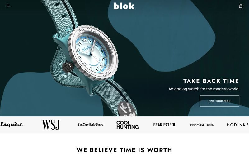
Blok is a premium analog-watch brand that treats the product page like a gallery wall: generous white space, sharp-cornered cards, and typography that leans on wide tracking to feel considered rather than loud. A single vivid teal — #1dd8e1 — does all the accent work, threading through button strokes, text links, and product dial highlights, while the rest of the palette stays architectural in dark navy-blacks and warm off-whites. Headlines are set in a heavy, wide-tracked Jost that feels almost industrial-luxe, contrasted against the rounded Poppins used for body and UI. Layout is centered, max-width-contained, and product-first: a dark hero with organic teal shapes gives way to white product grids, a single light-gray press band, and flat-light product detail pages. Components are flat, hairline-bordered, and almost shadeless — confidence comes from type scale and spacing, not elevation.