# HNST Studio — Style Reference
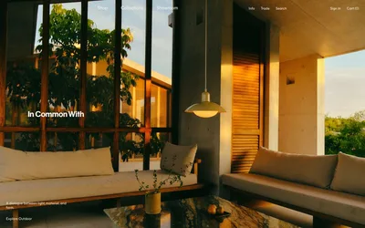
> earthy atelier with rust on linen — a slow-fashion gallery where a single burnt-orange accent warms an otherwise monastic cream and charcoal interior

**Theme:** light

Source measurements are normalized; roles and recommendations are interpreted. Font summary lists are independent, not paired by position. HTML examples are reconstructions, not source components.

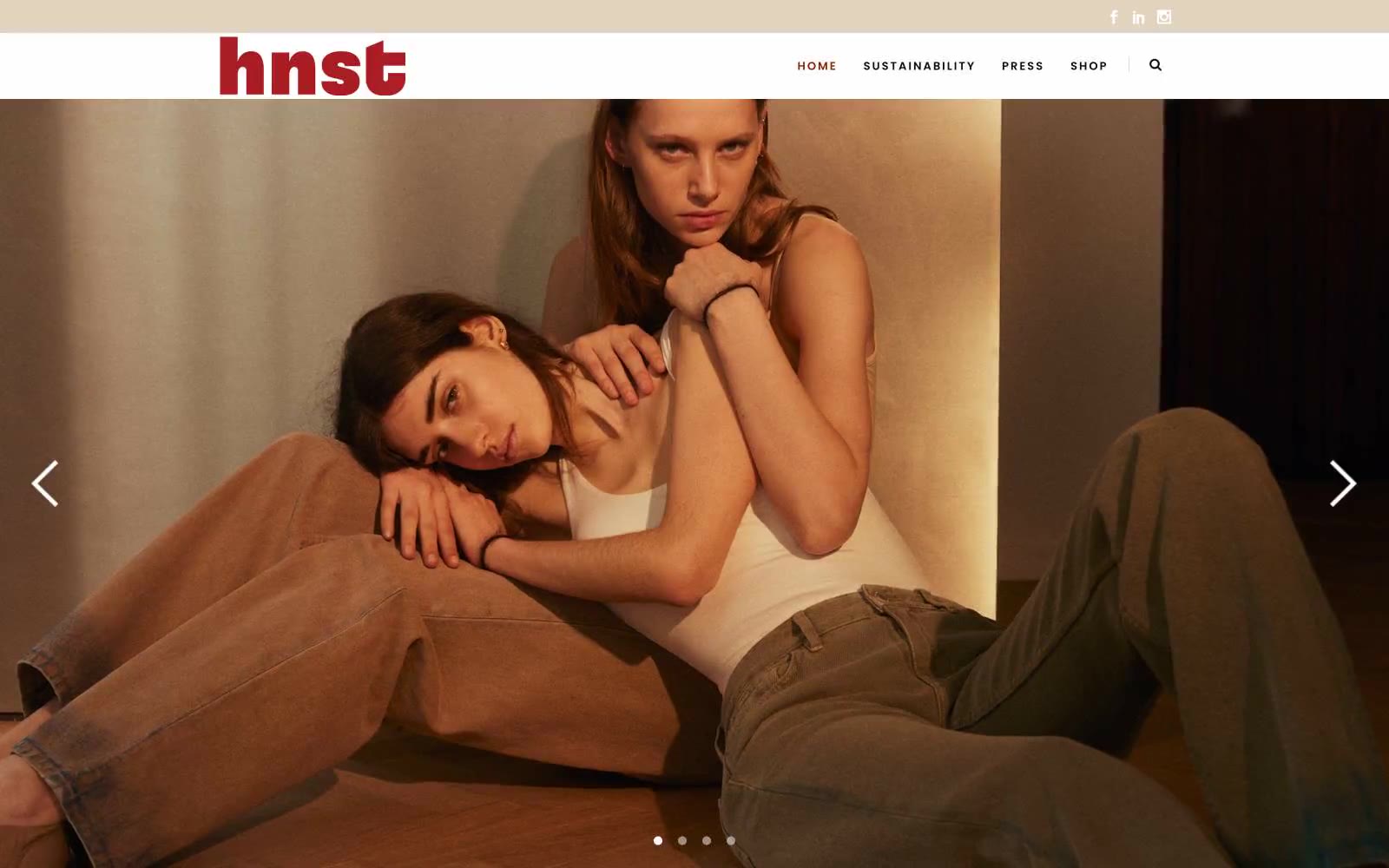
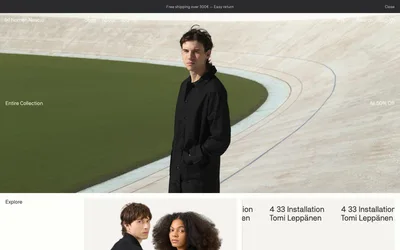
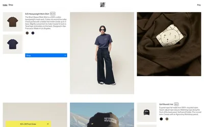
HNST Studio speaks in a warm, earthy editorial language: bone-white canvases tinted with raw silk cream, a single rust accent that anchors every interactive moment, and gallery-style uppercase typography that lets the photography breathe. The site treats full-bleed fashion imagery as the primary surface — text and chrome are whisper-thin, positioned like museum placards around the visual work. Two type families divide labor cleanly: Raleway handles UI, navigation, and body copy in humanist proportions, while Poppins takes display headings with extreme letter-spacing, turning section labels like 'TRENDING' into printed gallery signage. Components are stripped to essentials — thin borders, soft sand-toned badges, charcoal ink for action, no shadows, no gradients — so the rust accent lands with editorial gravity against the otherwise neutral palette.