# Moxie — Style Reference
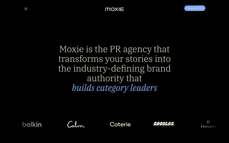
> Editorial darkroom with a single periwinkle flare — serif headlines float on a black void while a vivid blue accent punctuates the silence.

**Theme:** dark

Source measurements are normalized; roles and recommendations are interpreted. Font summary lists are independent, not paired by position. HTML examples are reconstructions, not source components.

Moxie's design system operates as an editorial PR-agency darkroom: deep black canvas, warm cream typography, and a single vivid periwinkle accent that lights up interactions like a stage spotlight. The pairing of IBM Plex Serif (for headlines) with IBM Plex Sans (for everything else) creates a magazine-meets-product tension — the serif whispers authority and editorial polish, while the sans keeps functional UI grounded and modern. Layout breathes generously with large centered serif hero statements, asymmetric card grids for work showcases, and horizontal scrolling case-study carousels. Color is used sparingly: the cream (#f4efd4) does the heavy lifting for text and hairline borders on cards, the periwinkle blue (#84acfb) acts as a singular accent for italic emphasis, active states, and the sole filled CTA, and deeper warm grays layer card-on-card depth. There are no shadows, no gradients, no decorative chrome — the system relies on generous spacing, type contrast, and selective color punctuation to create hierarchy.