# HOUSEPLANT — Style Reference
> walnut bookstore on linen paper

**Theme:** light

Source measurements are normalized; roles and recommendations are interpreted. Font summary lists are independent, not paired by position. HTML examples are reconstructions, not source components.

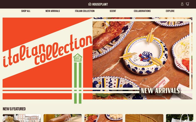
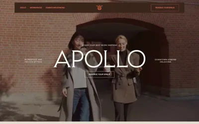
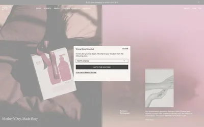
Houseplant operates in a warm, earthy monochrome — deep walnut brown on aged cream, with the product photography doing all the chromatic work. The system reads like a vintage housewares catalog: tight custom typography, generous breathing room, no decorative gradients, and almost no accent color. The dark brown #321e1 is both text and surface, flipping between background and foreground depending on context, while the cream #f4f1e1 plays canvas. Components are minimal — solid filled buttons, hairline dividers, soft cards with a single subtle shadow. The signature move is the oversized custom wordmark that anchors the page footer, treating the brand name as a graphic element rather than a logo.