# Ferrari — Style Reference
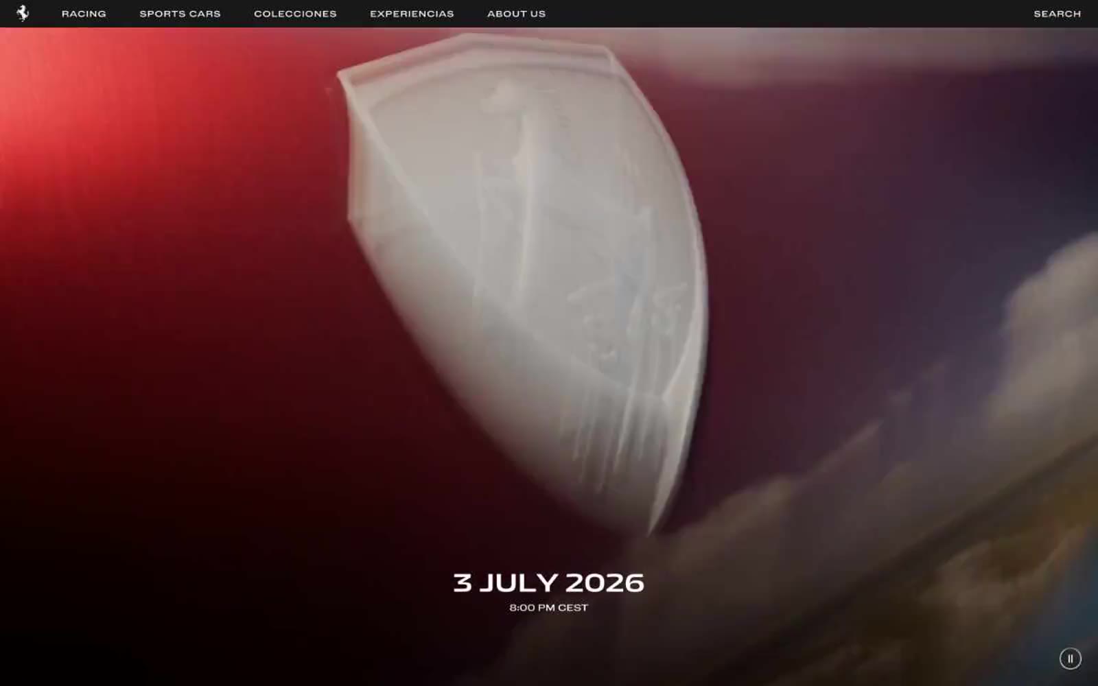
> cavallino rampante on black marble. Black voids punctuated by singular Ferrari red, white uppercase tracking, and full-bleed cinematic photography.

**Theme:** dark

Source measurements are normalized; roles and recommendations are interpreted. Font summary lists are independent, not paired by position. HTML examples are reconstructions, not source components.

Ferrari.com speaks in a restrained editorial whisper over cinematic darkness: a predominantly black canvas broken by full-bleed photography and a single signal red that interrupts only when something demands attention. Typography is set in uppercase with wide tracking, small sizes, and tight weights — the type behaves as captions and labels, never as decoration. Layout favors negative space, centered compositions, and vertical scrolling over chrome — the cars and content breathe in full-viewport panels while navigation sits flat and borderless, signaled by color shifts rather than rules. Every element is reduced to its essential geometry: square corners, hairline dividers, flat surfaces, no rounded buttons.