# Sublime — Style Reference
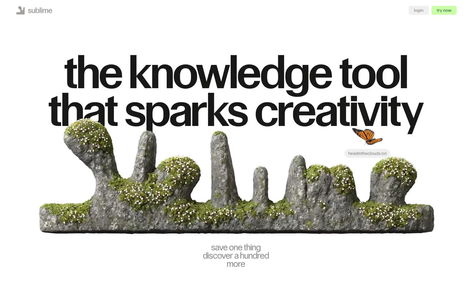
> white-walled curator's atelier — a quiet gallery where one bold black headline holds the room and a single green object is always the only thing worth picking up

**Theme:** light

Source measurements are normalized; roles and recommendations are interpreted. Font summary lists are independent, not paired by position. HTML examples are reconstructions, not source components.

Sublime operates as a digital atelier: vast white walls, a single monumental headline anchoring each view, and collected objects (text snippets, vintage images, 3D renders) that feel curated rather than organized. The palette is 98% achromatic — black on white carries the entire interface, with two whisper-soft washes (pale blue, pale green) and one vivid moss green that punctuates moments of intent. Typography does the structural work: a custom geometric sans at extreme sizes and tight tracking creates headline gravity, while Times New Roman supplies a literary counterpoint for body copy and quotes — the serif/sans collision is deliberate editorial tension, not a system oversight. Layout breathes aggressively — centered compositions, floating collaged elements that overlap and ignore grid lines, generous vertical rhythm. Radii split into two modes: crisp 5px for functional controls, 999px pill for tags and special actions.