# Assembly Coffee London — Style Reference
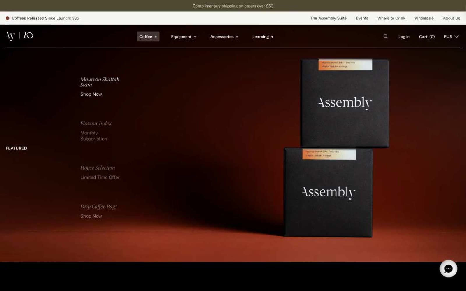
> Embers in a dark roastery. A near-black canvas with warm, low-lit product photography and italic serif labels — the feeling of a specialty coffee menu printed in a midnight zine.

**Theme:** dark

Source measurements are normalized; roles and recommendations are interpreted. Font summary lists are independent, not paired by position. HTML examples are reconstructions, not source components.

Assembly Coffee's visual system reads like an editorial magazine printed on black paper. The interface is overwhelmingly dark — near-black canvases carry everything — interrupted only by product photography lit against warm studio backdrops (ember-red, deep amber) and hairline typography in white. Two type families do all the work: a geometric sans (GT America) for UI scaffolding, navigation, and metadata, and a refined serif (ID00 Serif) for product names, section labels, and editorial copy, almost always in italic, which turns a functional nav list into a curated index. The palette is almost monochromatic: the chromatic vocabulary is rationed to badge fills (pale yellow, sage green, antique gold) and the occasional warm-tinted cream surface. Buttons are not loud — price chips and 'Shop Now' links live as small text or pill-shaped cream labels. Components are thin, sharp-cornered, and rely on borders and weight contrast rather than shadows or fills for separation.