# Savvycal — Style Reference
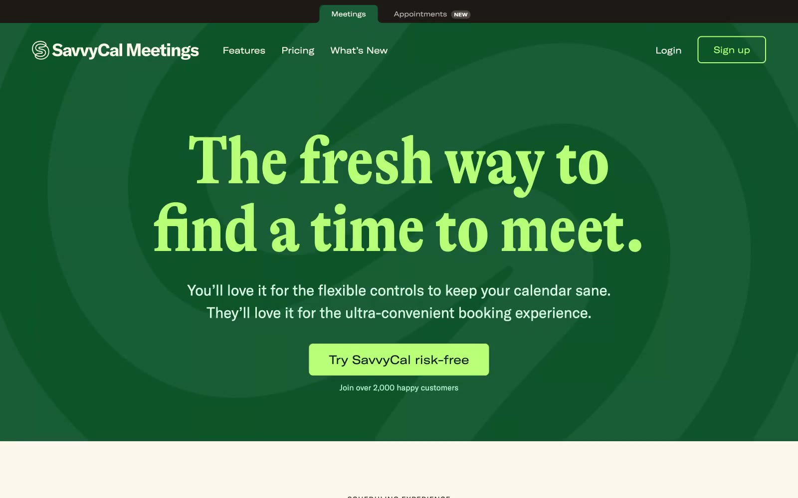
> forest-green stage with cream paper pages, serif headlines and lime-green punctuation

**Theme:** mixed

Source measurements are normalized; roles and recommendations are interpreted. Font summary lists are independent, not paired by position. HTML examples are reconstructions, not source components.

SavvyCal runs on a two-zone editorial system: a forest-green hero stage and a warm cream-paper body. The personality is magazine-meets-product: a condensed display serif (GT Alpina) headlines with editorial weight, while a grotesk workhorse (GT America) carries body and UI. A single lime-sprout green punctuates every interactive moment, and a coral red lives only as decorative punctuation — wavy underlines, hand-drawn doodles, thin frame borders. The aesthetic borrows from print: warm neutrals, serif voice, generous whitespace, and handcrafted accents that soften the scheduling-tool utility. Screens should alternate between the dark stage (used sparingly for hero, feature spotlights) and the cream canvas (the default for features, pricing, content), never blending the two in one view. Surfaces stay matte and flat — no glassmorphism, no heavy elevation. Color appears as small functional dots, not washes.