# Glitch Blog — Style Reference
> Neon zine on white paper

**Theme:** light

Source measurements are normalized; roles and recommendations are interpreted. Font summary lists are independent, not paired by position. HTML examples are reconstructions, not source components.

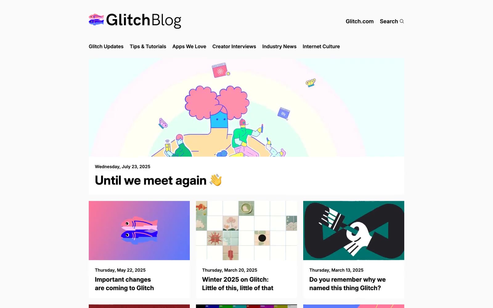
Glitch Blog reads as a digital zine: white paper canvas, confident sans-serif type, and almost no UI chrome between the reader and the work. The signature choice is a single electric magenta (#ff00bc) that appears sparingly — in the logo mark, link underlines, and the 'All Stories' call — giving the page a spark of personality without ever overwhelming the editorial content. Blog cards are stripped to essentials: a wide image, a small date meta line, and a medium-weight title — no shadows, no borders, no tag pills. The visual system trusts that the artwork in each post carries the page, so the interface recedes. Density is comfortable with generous 20px gaps and 48px section spacing, creating a magazine-like reading rhythm rather than a dashboard grid.