# Home — Style Reference
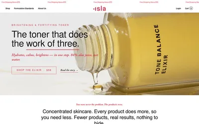
> Botanical specimen on vellum — an oxblood-stamped plate of golden fat, edges sharp, paper warm, nothing rounded.

**Theme:** light

Source measurements are normalized; roles and recommendations are interpreted. Font summary lists are independent, not paired by position. HTML examples are reconstructions, not source components.

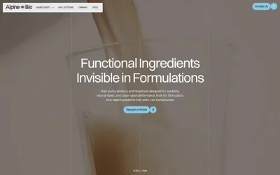
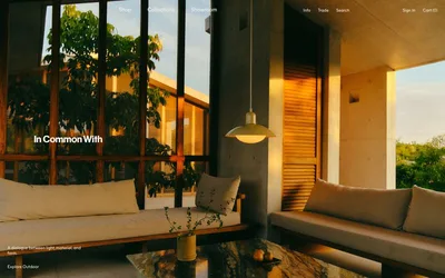
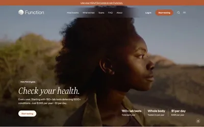
Savor uses a warm editorial-ingredient-archive language: cream-paper canvases, full-bleed macro photographs of fats and oils as the dominant visual, and a single deep oxblood accent that replaces shadows with hairline 1px borders. Typography carries a deliberate weight contrast — Roslindale Display Condensed whispers at weight 300 across 120–140px display lines, while Suisse Intl handles body, nav, and UI chrome at 400/700. Components stay thin and outlined rather than filled: a uniform 5px corner radius across buttons, cards, and badges, generous warm-cream negative space, and a palette of essentially three tones — cream, oxblood, and ink. The site reads less like a product page and more like a botanical plate or a science monograph photographed in late-afternoon light.