# Runway — Style Reference
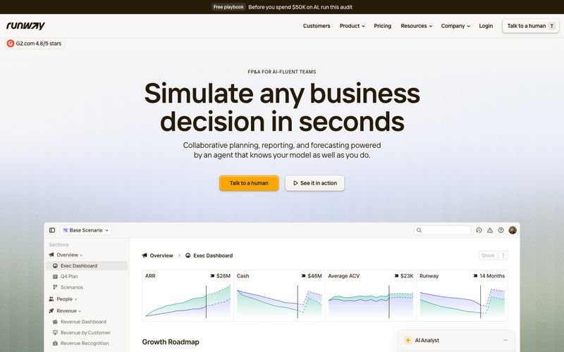
> Kraft paper ledger under amber desk lamp. Every screen should feel like opening a well-organized financial notebook: cream paper, espresso ink, one warm highlight color, no cold digital surfaces.

**Theme:** light

Source measurements are normalized; roles and recommendations are interpreted. Font summary lists are independent, not paired by position. HTML examples are reconstructions, not source components.

Runway renders a warm, paper-like financial workspace: a cream canvas (#f8f7f5) holds white card surfaces, linen-warm dividers (#e3dfd5), and deep espresso text (#261b07) that feels printed rather than rendered. A single amber accent (#f9a600) is the only chromatic signal in the interface — it marks the primary action and never decorates, giving CTAs the weight of a highlighter on a ledger page. Typography is tight and slightly humanist via the custom Interphases Pro Variable font with non-standard weights (492, 584), producing a confident density that reads like a well-set business document. Shadows are warm-tinted browns, not cool grays, so even elevation feels like layers of kraft paper rather than floating panels. The whole system communicates analytical warmth — serious about numbers, soft on the eyes.