# Enter GmbH — Style Reference
> Bauhaus poster workshop, midday sun

**Theme:** mixed

Source measurements are normalized; roles and recommendations are interpreted. Font summary lists are independent, not paired by position. HTML examples are reconstructions, not source components.

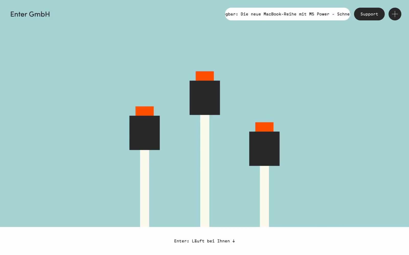
Enter GmbH reads like a Bauhaus-influenced IT services brochure printed on warm stock: bold full-bleed color panels (seafoam, cream, signal orange) stack like poster sheets, and a monospaced face (Maax Mono) carries nearly every word, giving the whole site the cadence of a technical readout rather than a marketing page. The visual rhythm is theatrical — each horizontal band changes color and mood, with no soft transitions, just hard seams between cream, teal, white, and orange. A single abstract geometric illustration of stacked blocks on poles lives in the hero, and every interactive control is a dark pill on a colored ground. Neutrality is the default (black on white for text, #282828 for filled buttons), with orange and teal used as architectural surfaces rather than accents — they ARE the layout, not decoration on it.