# Marco — Style Reference
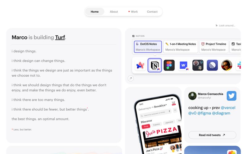
> Moleskine notebook in cool morning light — a personal workspace where widgets float like sticky notes on warm paper.

**Theme:** light

Source measurements are normalized; roles and recommendations are interpreted. Font summary lists are independent, not paired by position. HTML examples are reconstructions, not source components.

Marco's site reads like a personal workspace laid out on cool paper: a near-white canvas, furniture-soft cards, and dense but breathable type that feels like a Moleskine spread in morning light. The layout is a disciplined two-column grid — a long-form manifesto on the left, a stack of embedded widgets, app screenshots, and avatar cards on the right — held together by generous rounded corners and whisper-light shadows. Color is rationed: 99% of the page is neutral, with violet and coral-pink appearing only as tiny functional punctuation for active links, the 'Work' status dot, and one warm gradient card. Typography is the main voice — three custom geometric sans-serifs (Maison Neue, Graphik, Neue Montreal) layered with careful tracking shifts, wide on micro-labels and tightening on larger display sizes.