# HBO Max — Style Reference
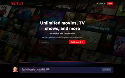
> Cinema lobby at midnight. Pure black walls, one cool blue exit sign, and movie posters glowing from every surface.

**Theme:** dark

Source measurements are normalized; roles and recommendations are interpreted. Font summary lists are independent, not paired by position. HTML examples are reconstructions, not source components.

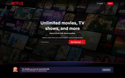
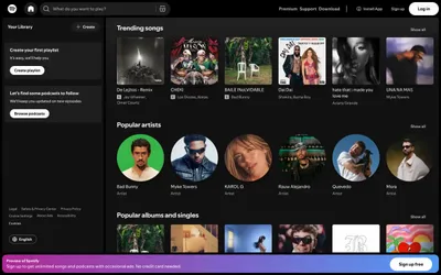
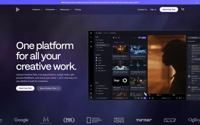
HBO Max is a cinema-dark streaming interface: deep black canvas, content poster art as the primary visual unit, and a single steel-blue accent that powers every interactive element. The design is deliberately sparse — white text floats on black, pricing cards flip the polarity to white-on-light to signal commerce zones, and typography does the heavy lifting through size and spacing rather than color. Components stay flat and minimal: 8px-radius buttons, hairline borders, no shadows, no gradients. The custom Max Sans typeface carries a slight positive letter-spacing on small labels, giving even utility text a cinematic, editorial quality.