# Sackville & Co. — Style Reference
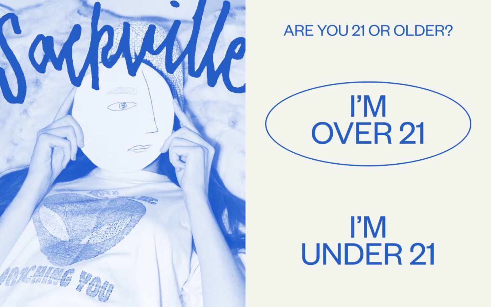
> Cobalt zine pressed onto cream — a hand-inked editorial spread where the illustration is the hero and the UI is just typeset text on warm paper.

**Theme:** light

Source measurements are normalized; roles and recommendations are interpreted. Font summary lists are independent, not paired by position. HTML examples are reconstructions, not source components.

Sackville & Co. reads like an editorial risograph zine pressed onto cream paper: a hand-inked cobalt-blue illustration anchors one half, while the other half breathes as off-white canvas with tight grotesque type and a single oversized oval outlined in blue. The system is intentionally print-coded — flat color, no gradients, no shadows, no filled buttons — and uses a saturated secondary palette (peach, fire-red, marigold, terracotta) as tonal accents in artwork and borders rather than as functional UI fills. Typography carries all the hierarchy: Founders Grotesk at weight 400 with aggressive negative line-heights (0.80–0.90) on display sizes creates the masthead pressure of a magazine cover, while TimesNow SemiLight provides editorial serif contrast for select headings. Everything feels hand-set: thin outlines, generous whitespace, no elevation, no rounded cards — just confident ink on warm paper.