# 2.AG — Style Reference
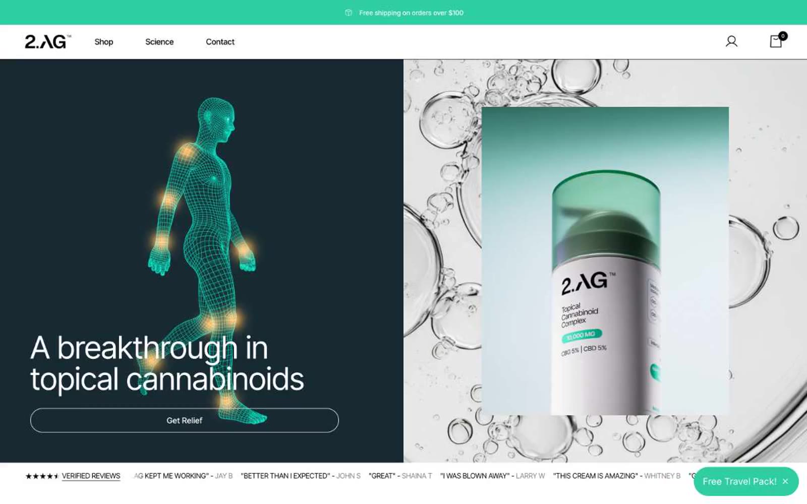
> Clinical apothecary under teal light — a measured, prescriptive wellness brand that treats the product shot like a specimen slide.

**Theme:** light

Source measurements are normalized; roles and recommendations are interpreted. Font summary lists are independent, not paired by position. HTML examples are reconstructions, not source components.

2.AG reads as a clinical apothecary crossed with a modern science brand: near-white canvas, deep teal structural surfaces, and one vivid mint accent that activates CTAs and data highlights. Inter Tight is tightened for a pharmaceutical voice — slightly negative tracking on display sizes, generous tracking on small caps for ingredient lists and badges. Components lean into large pill radii (30–50px) for buttons and soft 12–20px corners on cards, signaling a brand that is precise about dosage but warm on the body. Dark teal sections (Rapid Relief Cream header, stat blocks) ground the page in clinical authority, while bright green punctuation provides energetic, almost pharmacy-shelf accent. Layout is split, generous, and product-forward: hero pairs a dark editorial half with a bright product half, sections alternate white and teal, and reviews/stats form dense but airy card grids.