# Twocreate — Style Reference
> gallery wall on cream paper

**Theme:** light

Source measurements are normalized; roles and recommendations are interpreted. Font summary lists are independent, not paired by position. HTML examples are reconstructions, not source components.

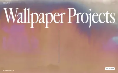
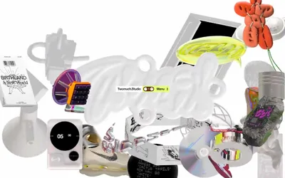
Twocreate operates on a gallery-floor logic: a warm cream canvas, a single near-black ink, one typeface, and absolutely nothing else. Every interface decision is subordinated to typography — there is no color system, no shadow system, no border system, no icon system, no button system. The page reads like a printed exhibition catalogue set in PP Neue Montreal at extreme scale jumps, from 10px footer labels to 111px display headlines that fill half the viewport. Components are not really components; they are typographic blocks separated by whitespace. The product photography that does appear is a single editorial image — no cards, no grids, no treatments — placed in the flow with the same restraint as the text. This is a studio site that trusts the work and the typeface to carry all visual weight, and treats every other design discipline as decoration to be omitted.