# Beautiful™ — Style Reference
> Warm kitchen on a Sunday morning

**Theme:** light

Source measurements are normalized; roles and recommendations are interpreted. Font summary lists are independent, not paired by position. HTML examples are reconstructions, not source components.

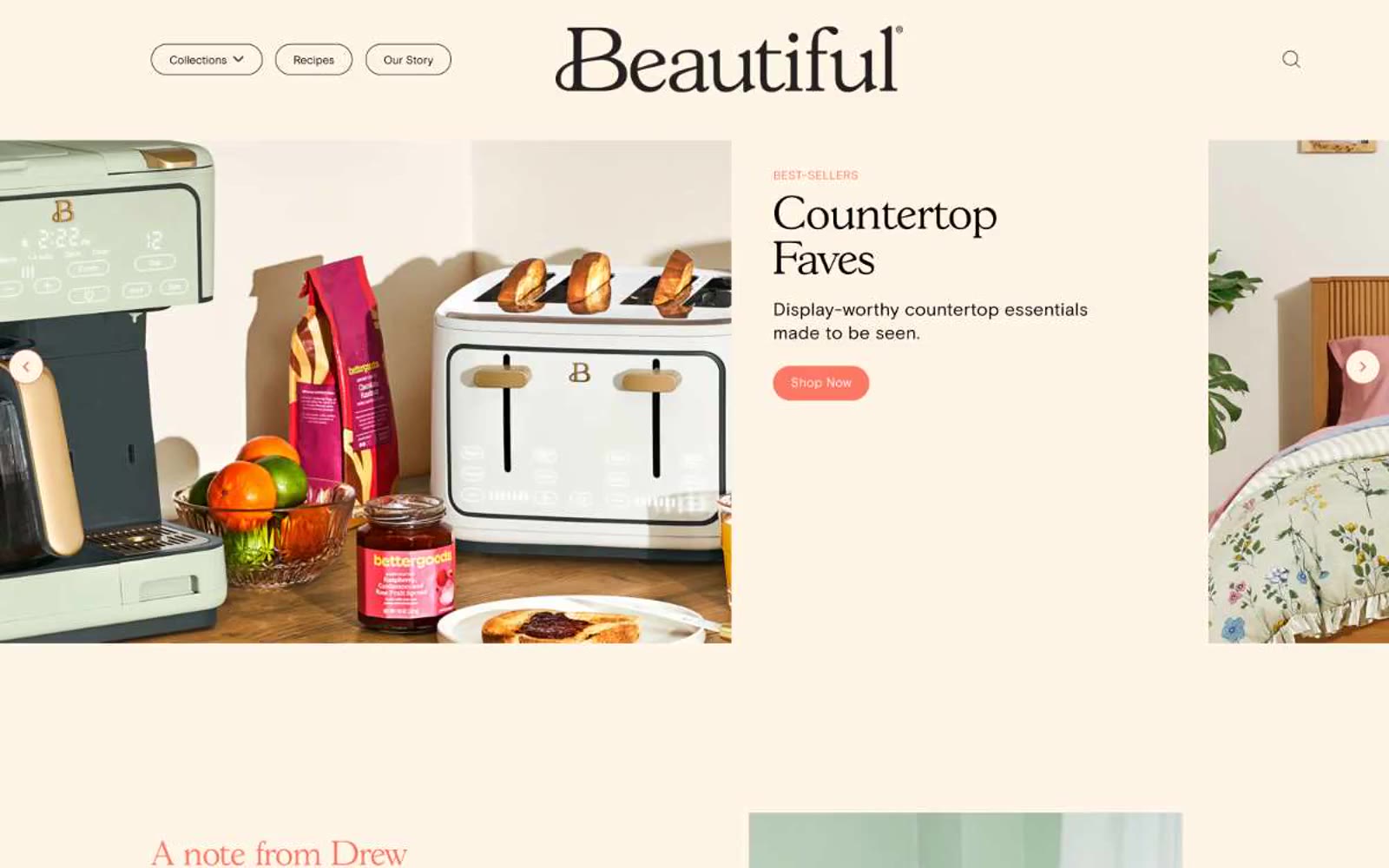
Beautiful's design system is a warm, domestic tableau: a cream-ivory canvas (#fff5e6) replaces the typical white product background, immediately signaling "home" rather than "software." A single vivid coral accent (#fa7864) punctuates the interface — appearing only on filled action buttons, the serif editorial headings, and one coral CTA banner — while everything else stays restrained: thin black 1px borders, white card surfaces, and an elegant GascogneTS serif paired with the practical Basis Grotesque Pro sans. Components lean generous and pill-shaped, always outlined in black rather than elevated with shadow, always warm-toned rather than cool-neutral. The system reads like a lifestyle magazine spread, not a product catalog: serif hero headlines whisper authority, the coral accent is rationed like saffron, and the cream canvas does the heavy lifting of mood.