# Frontify — Style Reference
> Warm atelier with orange punctuation — a museum catalog rendered in cream and ink, where a single warm orange acts as the only raised voice in an otherwise hushed room.

**Theme:** light

Source measurements are normalized; roles and recommendations are interpreted. Font summary lists are independent, not paired by position. HTML examples are reconstructions, not source components.

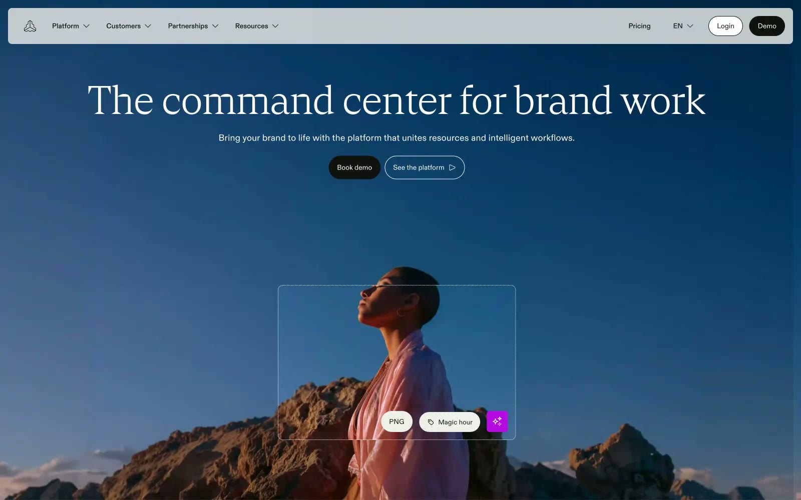
Frontify operates as an editorial brand-management workspace: a warm cream canvas (#f0f0eb) holds white card surfaces and dark teal hero moments, with a single vivid orange (#ff3b00) acting as functional punctuation rather than decorative color. Typography carries the identity — a high-contrast serif display face (Cranny) sets an editorial, near-print tone at 40–96px, while a clean grotesque (ABC Diatype) handles all interface text at 14–18px with positive tracking. The system avoids heavy shadows and gradients, relying on warm neutrals, hairline borders, and comfortable 8px-base spacing to create a calm, considered density. Components feel lightweight: 8px card radii, pill buttons at 24–40px, ghost controls, and image-forward compositions where brand assets become the hero content.