# Pinterest — Style Reference
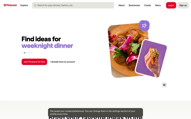
> A pinboard under warm gallery light — white walls, one bold red thumbtack, everything else quietly waiting to be discovered.

**Theme:** light

Source measurements are normalized; roles and recommendations are interpreted. Font summary lists are independent, not paired by position. HTML examples are reconstructions, not source components.

Pinterest operates as a bright, gallery-lit scrapbook: white canvas, near-black text in a custom geometric sans, and one unmistakable red that acts as the only functional signal in an otherwise quiet interface. The visual rhythm is built on oversized rounded corners (16-40px), generous breathing room between elements (16-32px gaps), and a typography attitude that uses size and italic weight — not color — to create hierarchy. Secondary hues (violet, orange, blue) appear as small decorative punctuation inside illustrated cards and image treatments, never on chrome or controls. Components feel lightweight and playful: tilted photo cards, pill-shaped search and filters, a flat red CTA, and a single high-contrast accent for emphasis. The system reads as approachable discovery, not utility — surfaces stay matte, elevation stays minimal, and personality comes from layout composition rather than decoration.