# CHELSEA — Style Reference
> Black-box cinema with a single blue spotlight — the roster plays, the chrome disappears.

**Theme:** dark

Source measurements are normalized; roles and recommendations are interpreted. Font summary lists are independent, not paired by position. HTML examples are reconstructions, not source components.

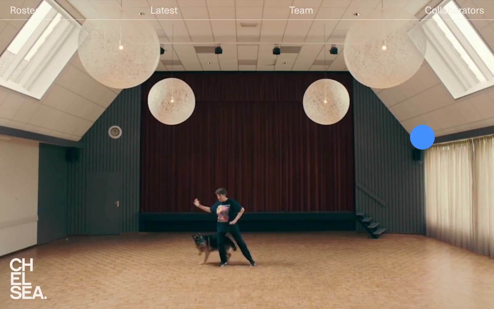
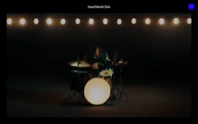
Chelsea is a talent roster presented as a black-box cinema: full-bleed cinematic photography sits directly on pure black, with a single vivid blue (#4490ff) as the only chromatic voice. The interface is deliberately skeletal — a thin top bar, a tiny floating blue dot, and a name list rendered in the accent color — letting the roster's work carry all visual weight. Typography is one family (Neue Haas Unica Pro) in two weights, set with tight 1.0–1.15 line-heights so the type reads like a film credit rather than a website. Everything that can be invisible is invisible: no borders on the canvas, no shadows, no card containers, no section backgrounds — the only surface transition is the sudden black-to-photography cut. Buttons and links are pill-shaped (9999px radius) and extremely compact, reinforcing the sense that this is a viewing room, not a product dashboard.