# MindMarket — Style Reference
> Warm storybook on cream paper — a friendly editorial canvas where oversized Inter headlines and paper-cut characters share a sunlit, sticker-soft surface.

**Theme:** light

Source measurements are normalized; roles and recommendations are interpreted. Font summary lists are independent, not paired by position. HTML examples are reconstructions, not source components.

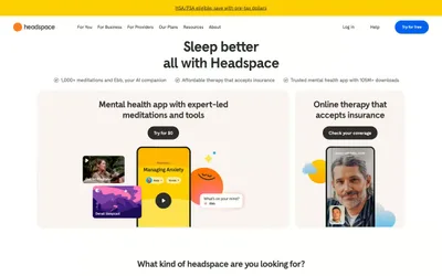
MindMarket is a warm, illustrated editorial system built on a cream-paper canvas rather than stark white, with massive Inter display type that fills the frame and a single vivid green accent that anchors the brand across navigation strokes, borders, and hero fills. The visual language borrows from paper-cut storybook illustration — flat, vibrant character art sits directly on warm neutral backgrounds, never on photographic or gradient surfaces, and the UI chrome is deliberately minimal so the artwork leads. Components are generously rounded (50–64px radii on cards and nav), creating a soft, sticker-like quality. Color behaves decoratively rather than functionally: the green, blue, red, and yellow accents repeat across illustrations and are used sparingly in UI as borders, icon accents, and surface highlights rather than as a strict semantic state system. The overall density is breathable and confident — few elements per screen, enormous type, wide margins, and the cream canvas doing the structural work that shadow systems usually handle in product UIs.