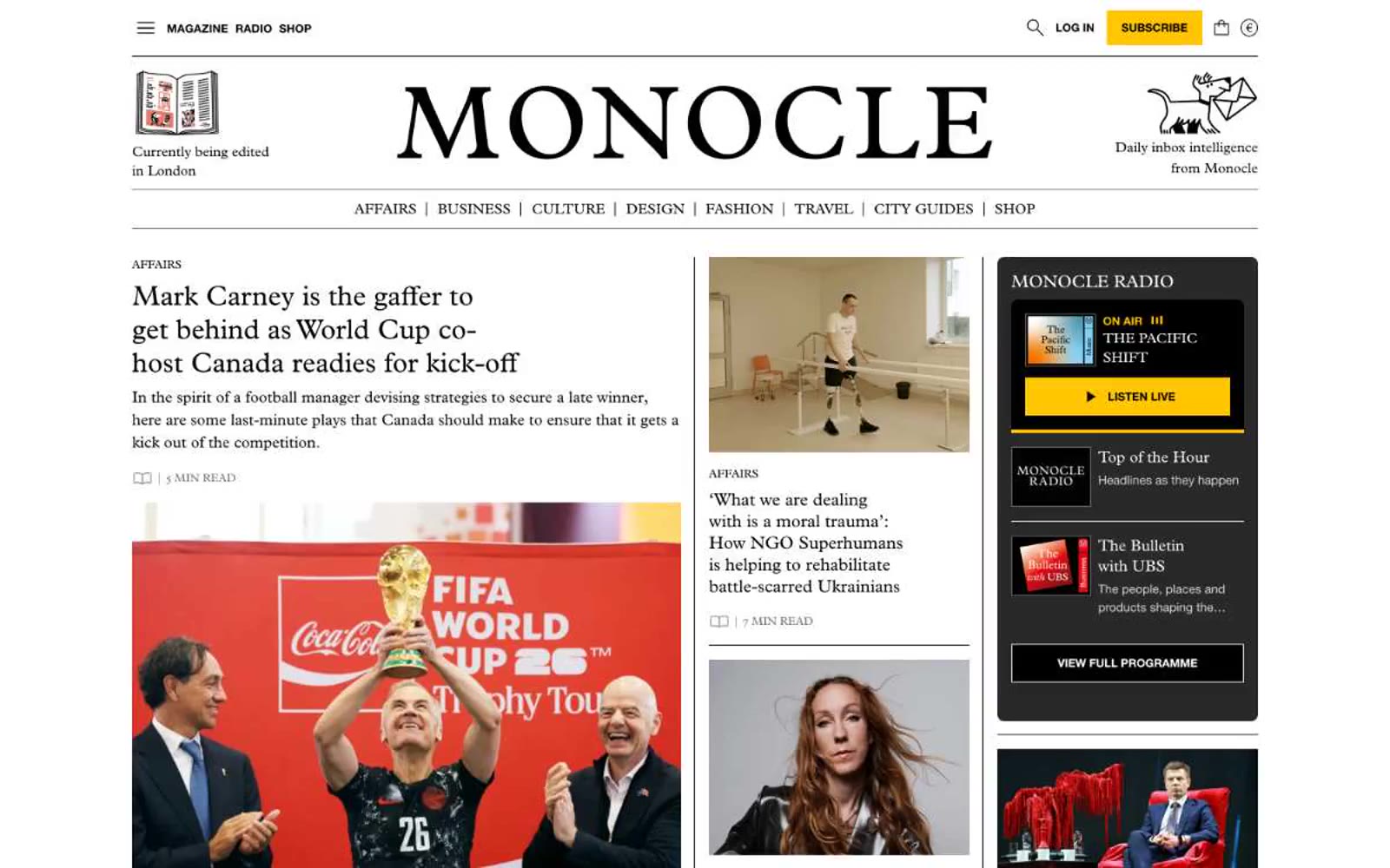
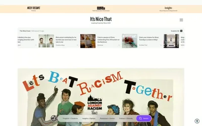
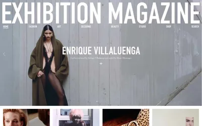
# Monocle — Style Reference
> Quality broadsheet on cream paper. A curated newsroom where every column earns its keep and the only color on the page is the one that matters.

**Theme:** light

Source measurements are normalized; roles and recommendations are interpreted. Font summary lists are independent, not paired by position. HTML examples are reconstructions, not source components.

Monocle reads like a quality broadsheet translated to the web: a warm cream canvas, generous serif typography in Plantin, and a tightly-edited grid that borrows from print pagination rather than app conventions. The entire interface is monochrome — black text, warm whites, and one unmistakable signal yellow (#ffc500) that functions as the magazine's only accent, reserved for the subscribe action, the radio card, and editorial illustration. Layout leans editorial: section labels run as tracked uppercase sans-serif eyebrows, headlines set in Plantin with negative tracking, and body copy in the same serif at a measured 16–18px. Components feel archival — thin rules, minimal radii, no drop shadows, and a 3-column grid that mixes large feature photography, opinion cards, and a persistent sidebar of audio/promo blocks. Density is high but never cluttered because spacing is compact and structural, not decorative.