# Redbrick Coffee — Style Reference
> Scarlet ink editorial on butcher paper

**Theme:** light

Source measurements are normalized; roles and recommendations are interpreted. Font summary lists are independent, not paired by position. HTML examples are reconstructions, not source components.

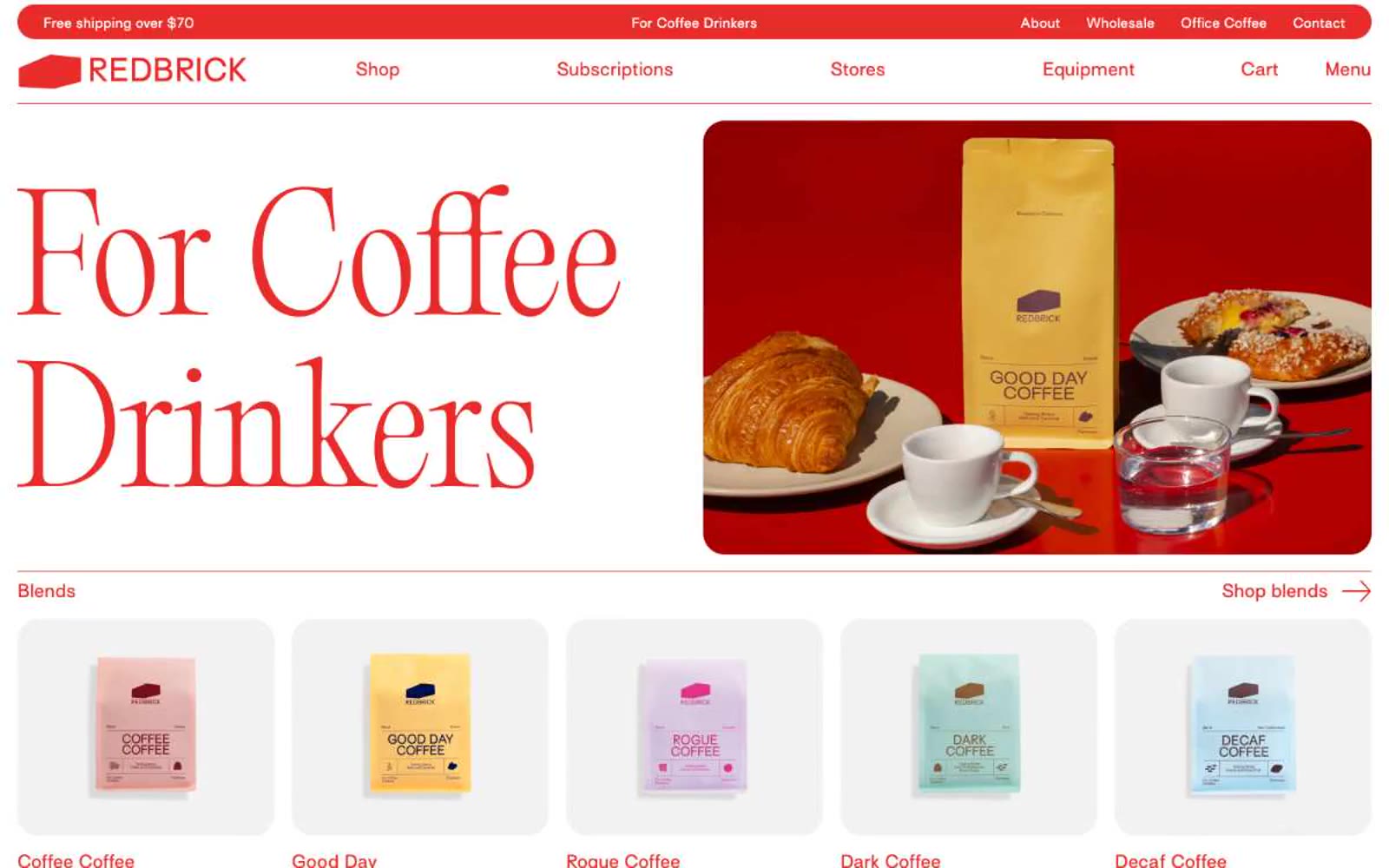
Redbrick is an editorial coffee storefront printed in scarlet ink on warm white pages. The system is defined by a single aggressive red (#e82c2a) that saturates every interactive surface — logo, nav text, section labels, borders, arrows, and the announcement bar — while the page canvas stays creamy white and cards sit on soft #f2f2f2 surfaces. Display headlines are a weight-300 didone-adjacent serif (Editorial Old) at extraordinary sizes (100–150px) with near-1.0 line-height, letting the letterforms breathe without bold weight. Body and UI copy use a humanist sans (Surt) with consistent positive tracking, giving even short labels a printed, typeset quality. Photography is overhead lifestyle — wooden tables, open books, espresso machines, hands cradling cups — warm and editorial rather than glossy e-commerce. Layout alternates half-width image and text blocks, anchored by tiny uppercase section labels and right-aligned arrow links that behave like magazine running heads.