# Yllw — Style Reference
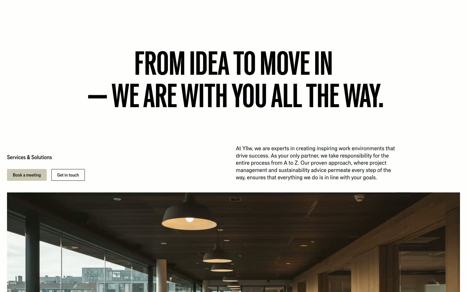
> Swiss-Bauhaus print monograph. Think oversized Grotesk on warm putty paper, hairline rules, no shadows — architecture rendered as typography.

**Theme:** light

Source measurements are normalized; roles and recommendations are interpreted. Font summary lists are independent, not paired by position. HTML examples are reconstructions, not source components.

Yllw is an editorial workspace brand: a single variable font pressed into monumental display sizes, a near-grayscale palette anchored by one warm putty neutral, and borders drawn with 1px inset strokes instead of shadows. The page reads like a Swiss-Bauhaus print artifact dropped onto a web canvas — oversized uppercase headlines (often 90–216px) with line-heights pulled tight to 0.88, a dominant putty-stone hue (#cac7b4) that functions simultaneously as canvas, button, and border, and a single signal-yellow announcement bar that acts as the only chromatic punctuation. Components are deliberately raw: 2px corners, hairline rules, no decorative gradients, no elevation depth — every surface is defined by adjacency, not by shadow. New screens should feel like pages from the same printed monograph, not like a product UI.