# Flim — Style Reference
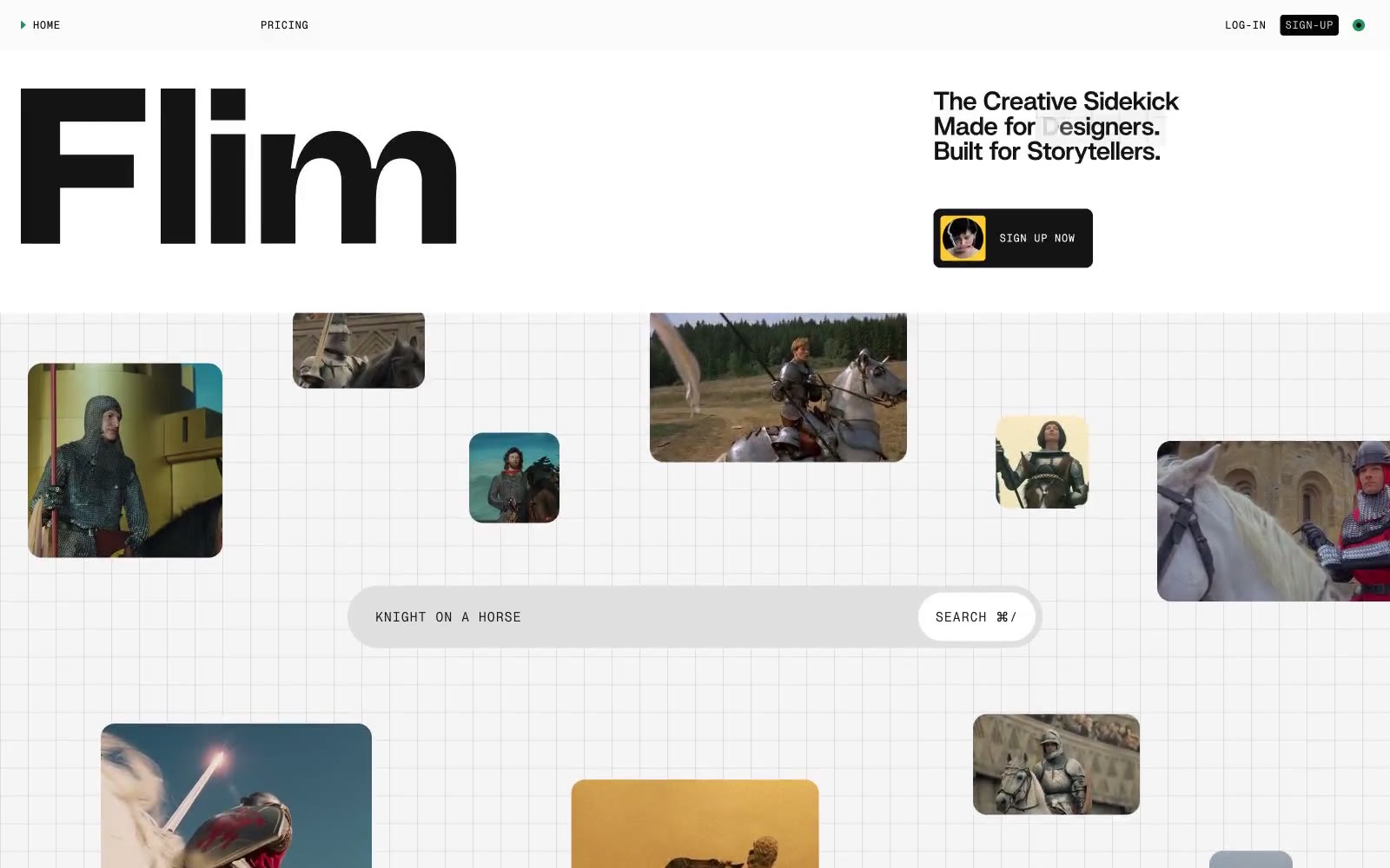
> Scattered polaroids on a sketchpad grid

**Theme:** light

Source measurements are normalized; roles and recommendations are interpreted. Font summary lists are independent, not paired by position. HTML examples are reconstructions, not source components.

Flim's design language is a creative-tool's analog workspace: a vast light-gray canvas etched with a subtle grid, scattered with rounded polaroid-like image cards, and anchored by a single oversized custom wordmark. The system is 99% monochrome — near-black ink on warm light gray paper — with tiny, deliberate splashes of signal green, ember orange, and highlight yellow used as functional punctuation rather than decoration. Typography splits into three voices: a heavy custom display face (Swizzy) for the hero wordmark, a mono micro-typeface (PP Neue Montreal Mono) for navigation, labels, and search placeholders, and system Arial for body. Components feel loose and handmade rather than gridded: pill-shaped search bars, image thumbnails with a 16px radius floating asymmetrically, ghost navigation, and a single hard-edged black button. The grid pattern and scattered image layout evoke a corkboard or lightbox — the visual metaphor of a creative agency's working surface.