# Fidèle Editions — Style Reference
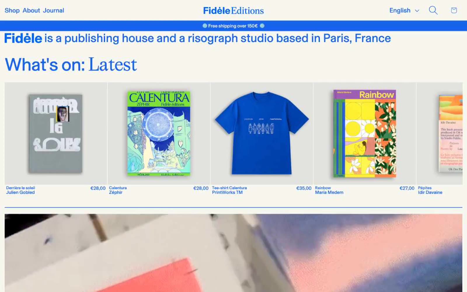
> Risograph blue ink on warm cream paper. A single fluorescent blue floods headlines, the announcement bar, and a giant asterisk logo, stamped onto a flat cream stock with zero shadows and near-zero rounding — the page reads as a printed broadsheet, not a SaaS interface.

**Theme:** light

Source measurements are normalized; roles and recommendations are interpreted. Font summary lists are independent, not paired by position. HTML examples are reconstructions, not source components.

Fidèle Editions operates as a risograph studio's web storefront: a warm cream paper canvas printed with one aggressive blue ink. The entire system is built on flatness — no shadows, no gradients, near-zero corner rounding, no decorative borders. Typography does the heavy lifting: a custom geometric sans (BaselGrotesk) at extreme size contrast, with display sizes crushed tight at 0.92 line-height and negative tracking, while small labels breathe with wide positive tracking. The vivid blue is used as a printing press uses ink — for type, nav, the announcement bar, and the massive asterisk logo — never as a subtle accent. Content lives in dense, editorial blocks: full-bleed imagery, tight product grids, photo strips. Every element feels stamped onto paper, not rendered on a screen.