# Zara — Style Reference
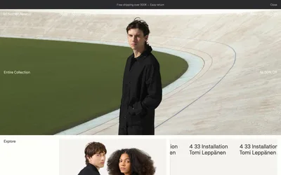
> Gallery wall for fashion — pure white space, hairline frames, editorial imagery as the only color.

**Theme:** light

Source measurements are normalized; roles and recommendations are interpreted. Font summary lists are independent, not paired by position. HTML examples are reconstructions, not source components.

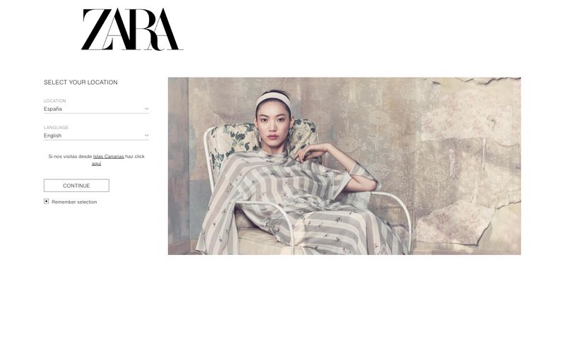
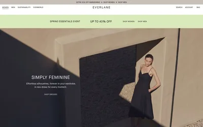
Zara's design system is editorial minimalism pushed to its logical extreme: a flat, monochromatic canvas where the interface deliberately recedes so editorial photography can carry the entire brand experience. The palette is essentially binary — pure black on pure white with a single mid-gray for secondary text — and the only decorative typographic moment is the ZARA wordmark itself, a high-contrast didone-style serif that functions as a logo, not as a heading font. UI typography is unusually compact (11–16px) and uses a single neutral sans-serif, giving every screen the look of a fashion magazine page. Components are borderless or use hairline strokes, with zero shadows, zero gradients, and zero rounded corners — the design language of a gallery wall, not a software product.