# Artboard — Style Reference
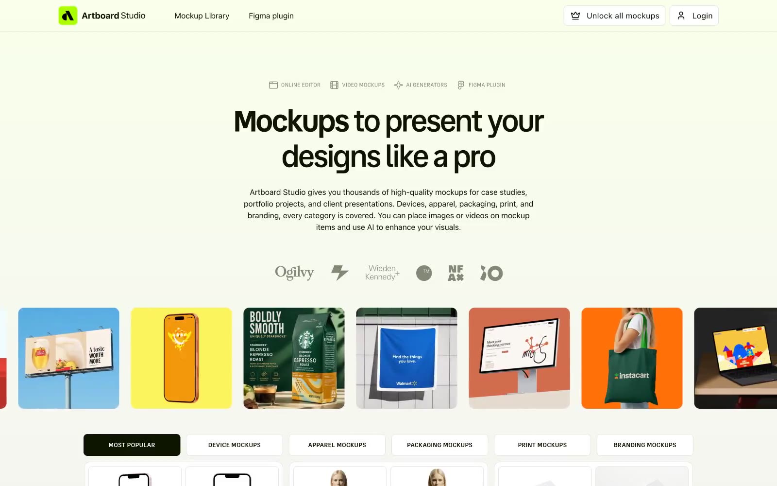
> Lime-voltage designer's tabletop. White paper, ink-black type, and one electric green that powers the whole studio.

**Theme:** light

Source measurements are normalized; roles and recommendations are interpreted. Font summary lists are independent, not paired by position. HTML examples are reconstructions, not source components.

Artboard Studio reads as a designer's toolshed laid out on a white tabletop — clinical canvas, high-contrast near-black type, and a single lime-green voltage that makes active states feel switched on. The system is overwhelmingly light and spacious, with confidence coming from tight tracking on large display type rather than weight or color. Buttons lean outlined rather than filled, borrowing the near-black as their stroke so primary actions feel like ink stamps on paper rather than glossy pills. Category surfaces (phone, apparel, packaging) are coded with soft pastel washes — peach, sky, mint — so visual variety arrives as color-coded cards, not gradients or shadows.