# ilovecreatives — Style Reference
> Gen-Z monochrome zine at viewport scale

**Theme:** light

Source measurements are normalized; roles and recommendations are interpreted. Font summary lists are independent, not paired by position. HTML examples are reconstructions, not source components.

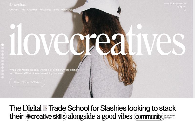
ilovecreatives is a monochrome editorial system for a Gen-Z creative community: every screen is a page from an indie print zine scaled to viewport. The palette is aggressively achromatic — deep ink black, soft charcoal, warm paper white, and one barely-there lime-cream surface — with zero chromatic accent. Photography carries the color: lush full-bleed color in the hero and course cards, then a deliberate pivot to high-contrast black & white in the profile grids. Typography is the only chrome: a Swiss grotesque (Suisse Regular) handles all UI, a custom Roman display serif (Romana) blasts the brand wordmark edge-to-edge across the hero, and aggressive negative letter-spacing ties everything to the page edges. Components are minimal: pill-shaped ghost buttons, pill-shaped location tags, 20px-radius photo cards, and almost no shadows. The feeling is warm, confident, editorial, community-first — never corporate SaaS.