# alet — Style Reference
> Vintage editorial contact sheet on warm taupe paper.

**Theme:** light

Source measurements are normalized; roles and recommendations are interpreted. Font summary lists are independent, not paired by position. HTML examples are reconstructions, not source components.

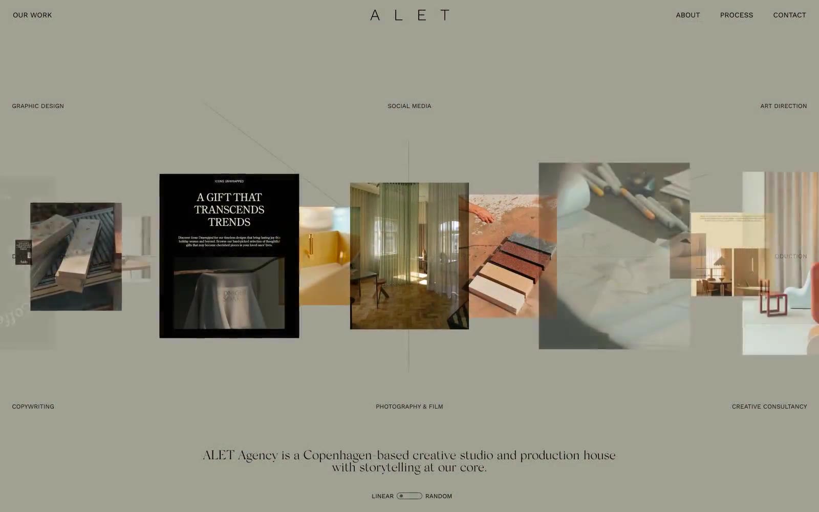
ALET Agency operates as a print-magazine spread translated to the web: a warm taupe canvas (#ada59b) swallows the entire page, typography stays whisper-small (11–13px WorkSans for all UI), and the ALET wordmark itself is set in a light serif with extreme letter-spacing that reads more like a magazine masthead than a logo. The entire color palette is strictly achromatic warm grays — there is no accent color, no CTA button fill, no state color. All visual interest comes from the photograph grid: an asymmetric, scattered arrangement of editorial imagery with floating category labels (GRAPHIC DESIGN, SOCIAL MEDIA, ART DIRECTION, etc.) positioned around it like captions on a contact sheet. Components are nearly invisible — no cards, no shadows, no fills, no rounded containers. The interface dissolves into the paper, and the work is the only thing the eye lands on.