# Medium — Style Reference
> cream-colored broadsheet at golden hour

**Theme:** light

Source measurements are normalized; roles and recommendations are interpreted. Font summary lists are independent, not paired by position. HTML examples are reconstructions, not source components.

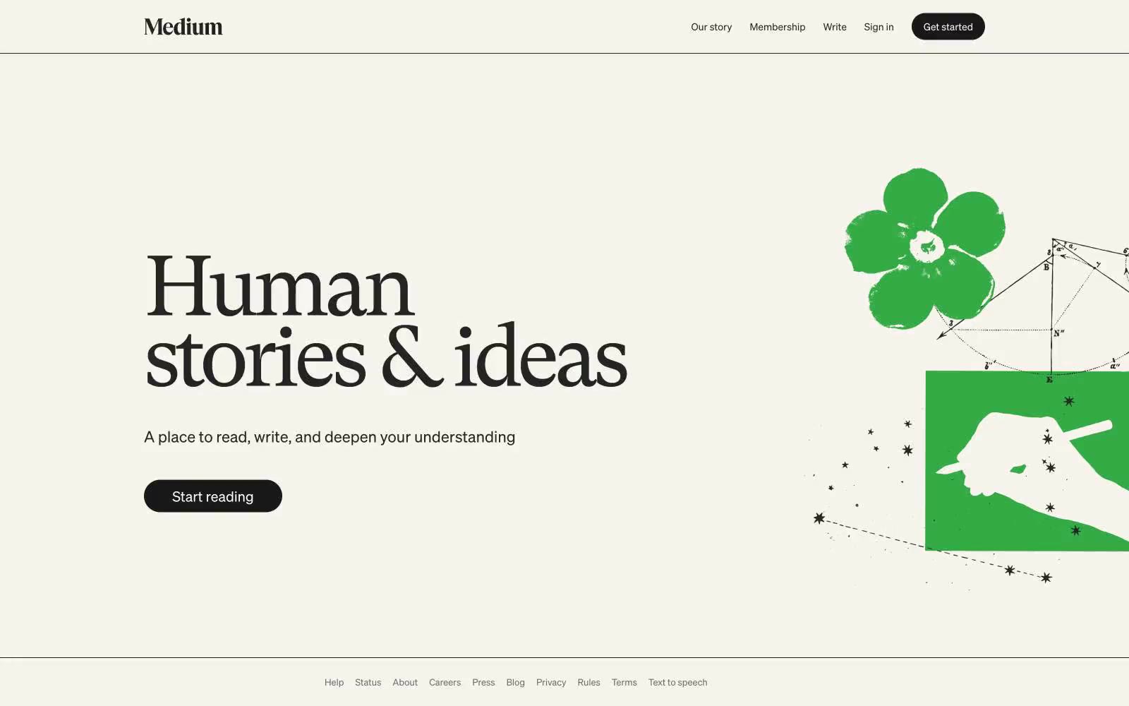
Medium operates as a literary reading room translated to the web: a warm cream canvas (#f7f4ed) replaces the sterile white common to SaaS, making long-form prose feel like a printed page. The visual system is aggressively monochromatic — nearly every UI surface, text, and border sits in a narrow band of warm grays from #242424 to #6b6b6b — so the reader's attention goes entirely to content. The single brand gesture is the serif hero headline (GT Super at 120px, weight 400, tracking -0.055em), a deliberate anti-trend choice: a transitional book serif at display scale with whisper weight, not a bold geometric sans, signals 'we publish books, not software.' Buttons are full pills in near-black, the only solid ink on the page.