# Pika — Style Reference
> Cream diptych meets cinema void

**Theme:** mixed

Source measurements are normalized; roles and recommendations are interpreted. Font summary lists are independent, not paired by position. HTML examples are reconstructions, not source components.

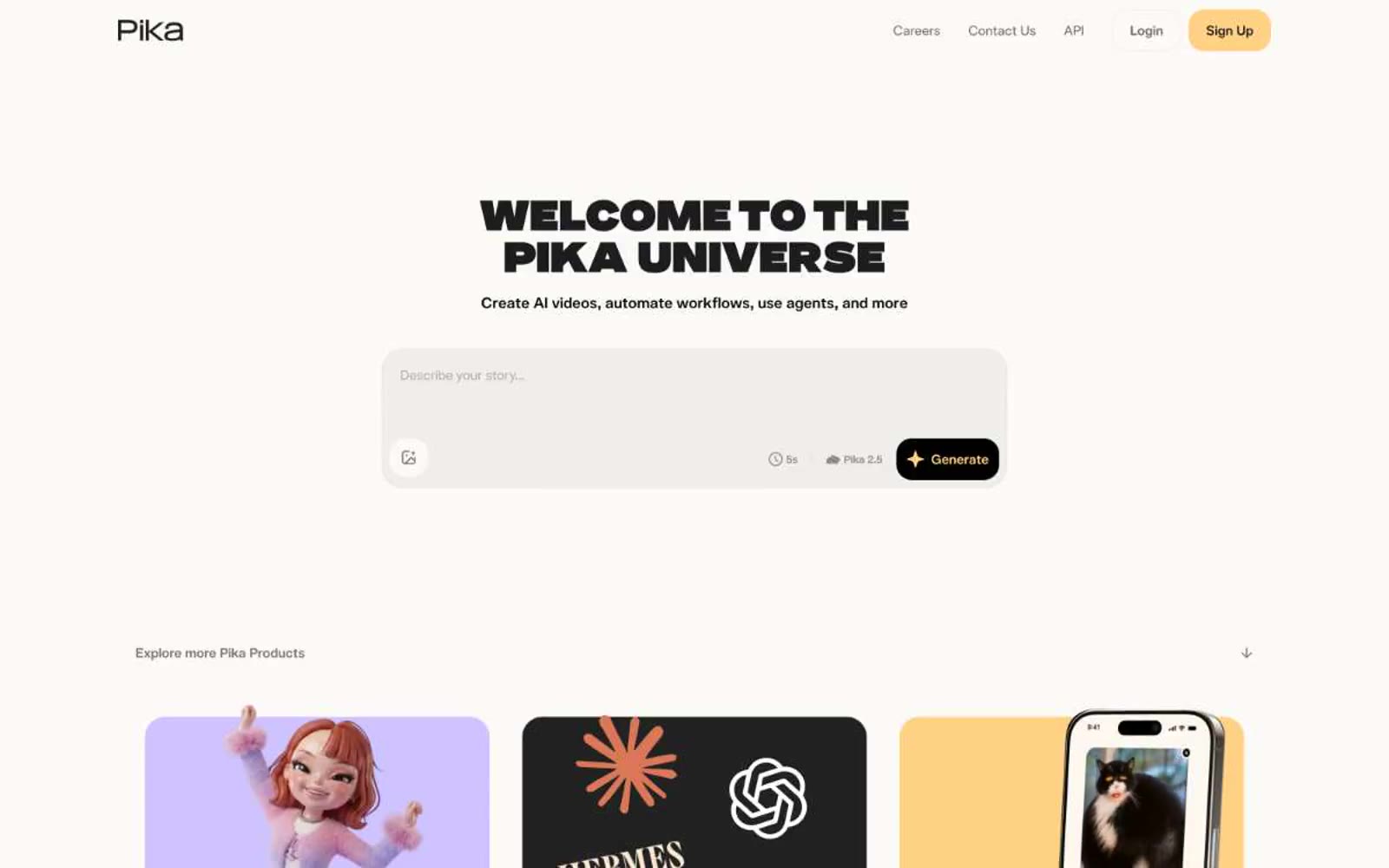
Pika is a warm-cold diptych: a cream paper canvas on the left holds the product (video, copy, brand mark), while a near-black void on the right houses functional UI (auth, navigation). The palette is almost monastic — black, white, cream, two grays — with cream (#ffedd2) acting as the only warmth, a deliberate foil to the cinematic dark that makes the AI-generated video read as 'premiere' rather than 'demo'. Type is a whisper-to-shout system: telka at weights 300-450 for everything functional reads like editorial body copy, while telkaExtended at weight 900 detonates on the single display heading ('REALITY IS OPTIONAL') to create punctuation, not hierarchy. Components are bare and rectangular: 6px-radius buttons, 10px-radius containers, 1px hairline borders, zero shadows. The design relies on contrast (cream/void, 300/900, still/motion) rather than ornament to carry the brand.