# Tparkes — Style Reference
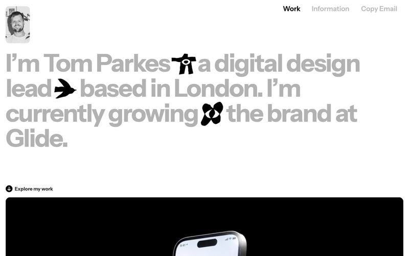
> Editorial broadsheet on white. A four-word image: a designer typesetting their own name at 86px and lets the page breathe around it.

**Theme:** light

Source measurements are normalized; roles and recommendations are interpreted. Font summary lists are independent, not paired by position. HTML examples are reconstructions, not source components.

Tparkes is a typographic portfolio that treats the page as a printed broadsheet: almost entirely monochrome, white-canvas, text-driven, with one warm cream accent (#f5ffbe) appearing as a flash of color on a single surface. The hero is a single oversized statement — Instrumentsans at 86px, weight 600, line-height 0.83, negative tracking — that swallows the viewport and uses inline glyph icons (bird, plane, flower) as visual punctuation rather than decoration. Everything else recedes: a tiny 4px-radiused avatar, 20px nav items, a thin hairline border as section divider, and work thumbnails that are full-bleed images with 16px radius and quiet captions underneath. The system is anti-decorative — no shadows, no gradients, no fills on buttons, no card elevation. Communication is carried by scale, weight, and proximity, not by color or chrome.