# Evergreen — Style Reference
> Sunlit greenhouse on linen paper

**Theme:** light

Source measurements are normalized; roles and recommendations are interpreted. Font summary lists are independent, not paired by position. HTML examples are reconstructions, not source components.

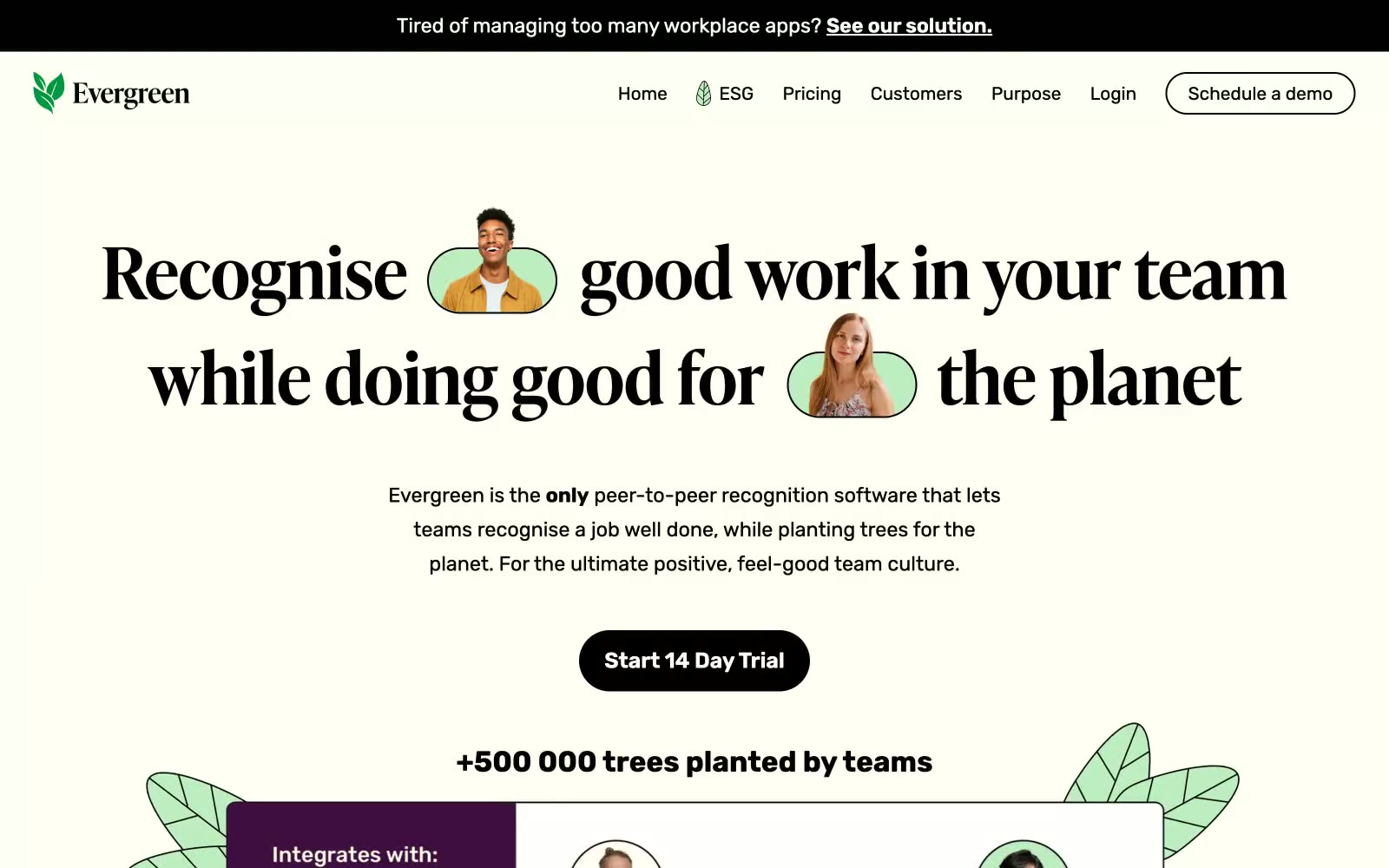
Evergreen uses a warm editorial language on a cream linen canvas, pairing a high-contrast didone-influenced serif for headlines with a friendly geometric sans for body. The palette is nearly monochrome — black ink, warm off-white surfaces, and a single soft sage mint used as organic highlight wash, never as decoration. The only saturated color is botanical and appears as a quiet accent inside avatars, badges, and illustrative leaves, never on buttons or large blocks. Components are rounded and tactile: pill-shaped primary buttons in pure black, 10px card radii, soft cream cards floating on the warmer page tone. Layout is centered and generous, with serif headlines large enough to dominate each section, body copy kept short and confident, and product/recognition mockups framed by hand-drawn leaf illustrations that bleed past their container edges.