# Chester's Garden — Style Reference
> Flimsy art-zine on drafting paper

**Theme:** light

Source measurements are normalized; roles and recommendations are interpreted. Font summary lists are independent, not paired by position. HTML examples are reconstructions, not source components.

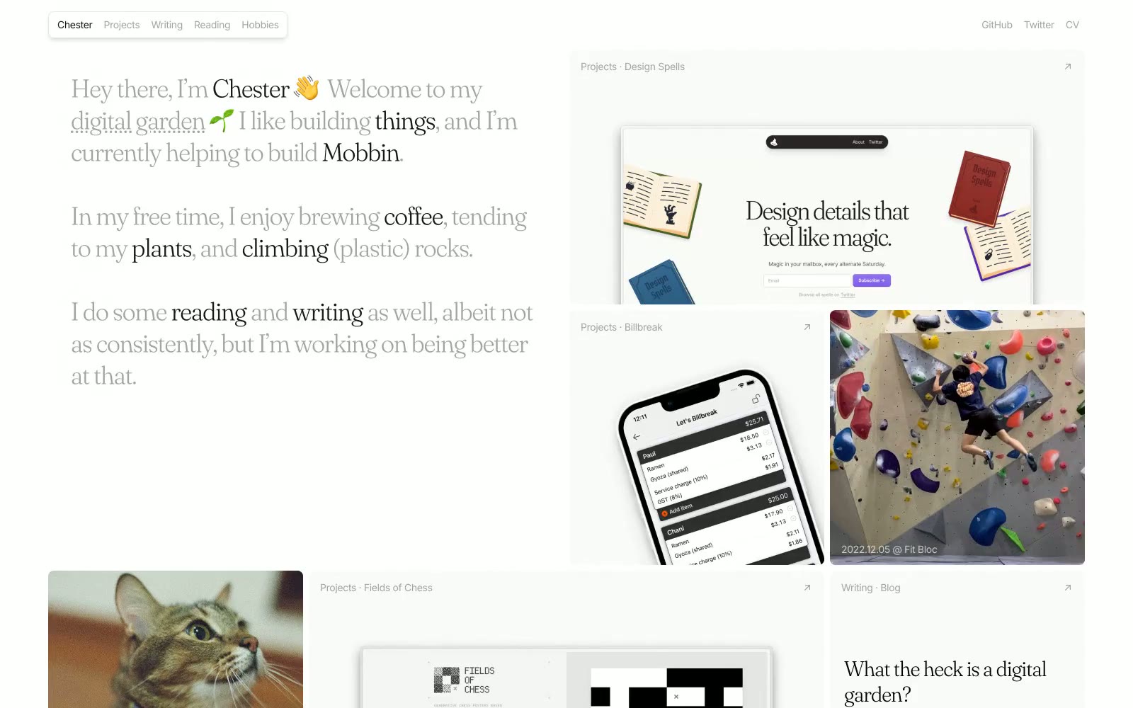
Chester's Garden is a personal digital garden rendered as a quiet, editorial broadsheet on soft gray paper. The visual language is deliberately unfussy: a near-white canvas layered onto a cool gray substrate, serif display type at whisper-weight 300 that feels typeset rather than designed, and a masonry grid where cards of varying heights lock together like magazine columns. Body text is compact Inter with selectively bolded words inside flowing sentences, echoing how a reader underlines a phrase in a book. Pastel tag pills (mint, butter yellow, sage) and one rust-orange link color provide the only chromatic moments — accents behave like highlighter marks, not like a brand identity. Everything else is restrained: hairline borders, tiny radii, no gradients, no decorative elevation, and images sit in their own muted card frames.