# Spécialiste Belge — Style Reference
> Linen-bound brand cookbook. Warm cream paper, black ink, single whispered serif, no decoration beyond the page edge.

**Theme:** light

Source measurements are normalized; roles and recommendations are interpreted. Font summary lists are independent, not paired by position. HTML examples are reconstructions, not source components.

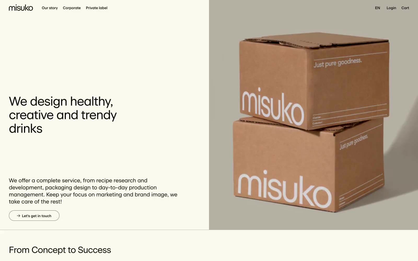
Misuko operates as an editorial atelier for beverage branding: a warm cream canvas (#fcf9ee) carries a single custom serif-influenced sans (beausite) set in tight tracking, producing a magazine-spread calm. Every element speaks the same warm-monochrome dialect — black ink, warm-gray dividers, and beige paper — so color is reserved for product photography (cardboard tan) and the occasional pastel icon, never for chrome or decoration. The interface is almost entirely flat: no shadows, no gradients, no rounded corners beyond a single 20px pill on links, and no chromatic button fills — actions are ghost-outlined in black. Information density stays low; breathing room is generous and rhythm is dictated by large display headlines followed by narrow body columns, with three-column service grids and case-study cards doing the structural work.