# EVOKE — Style Reference
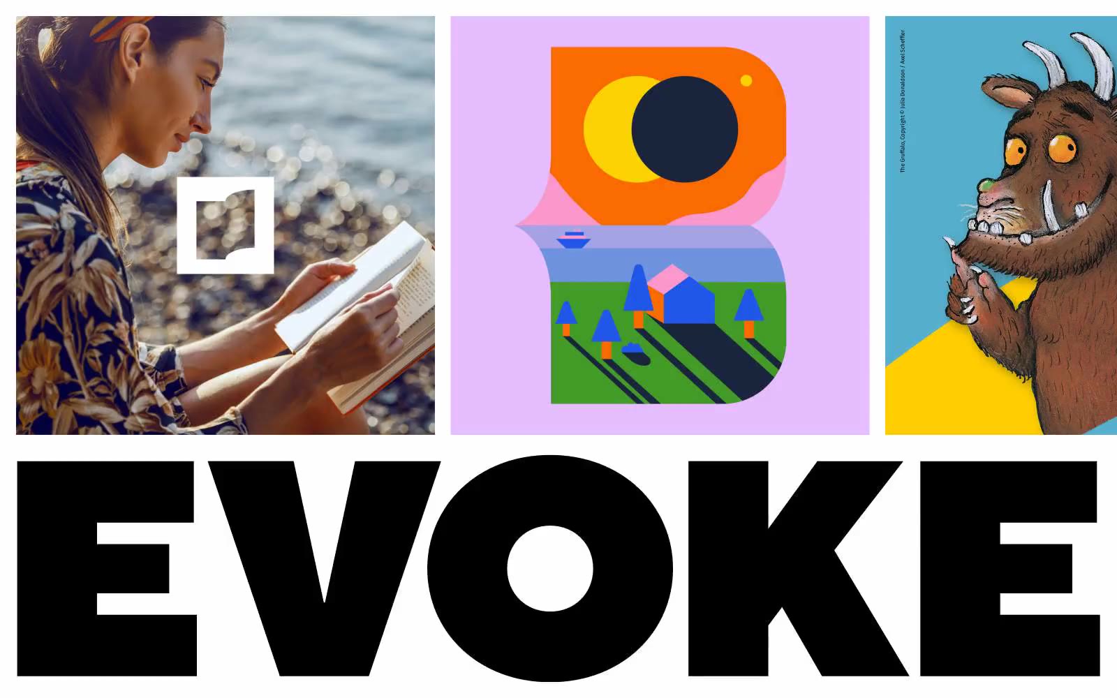
> Saturated flat tiles swallowed by a massive black wordmark

**Theme:** light

Source measurements are normalized; roles and recommendations are interpreted. Font summary lists are independent, not paired by position. HTML examples are reconstructions, not source components.

EVOKE is a design studio site that speaks in full-bleed saturated color panels — coral, cyan, yellow, lavender — each one a flat, unmodulated field that doubles as a section anchor. The work lives in a tight 3-column grid of oversized tiles where lifestyle photography, flat vector illustration, and licensed cartoon character art share equal billing at full bleed with no framing or padding. Type is deliberately compressed: TT Norms Pro sets everything, with the Normal weight for content headings and ExtraBlack reserved for the brand wordmark itself, which becomes architecture — a slab of near-black display type at massive scale that anchors the lower half of the page. The system rejects depth entirely: no shadows, no gradients, no rounded softness, no card chrome. Visual hierarchy comes from scale, color contrast, and full-bleed composition rather than z-axis separation. Every surface is a declaration; every wordmark is a wall.