# Supahub — Style Reference
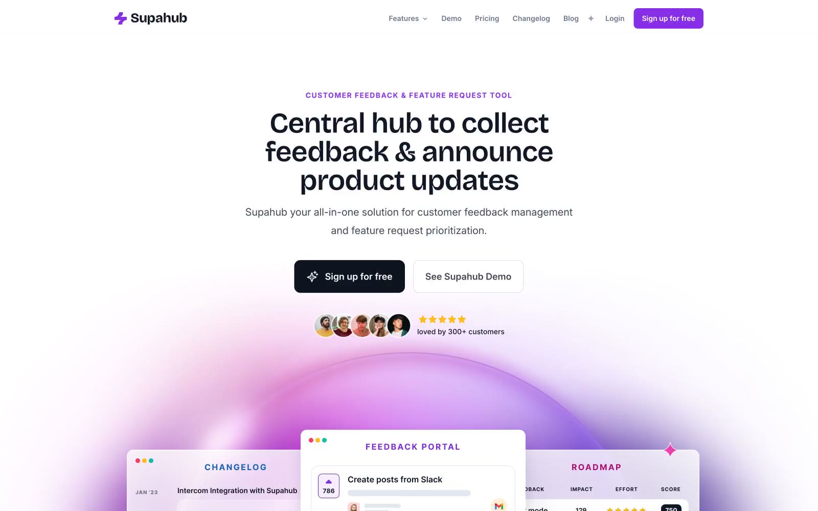
> Soft daylight on a violet ridge. A mostly white, airy canvas lit by a single bright violet sun, with decorative gradient orbs spilling color into negative space and generous rounded geometry giving every surface a friendly, tactile weight.

**Theme:** light

Source measurements are normalized; roles and recommendations are interpreted. Font summary lists are independent, not paired by position. HTML examples are reconstructions, not source components.

Supahub is a sunlit feedback platform rendered in soft white space punctuated by violet confidence. The system favors a quiet, mostly achromatic canvas where a single vivid violet (#862fe7) carries all primary action weight, then lets decorative lavender, pink, and amber gradient orbs burst through hero and feature sections to dramatize product surfaces. Typography is a Bricolage Grotesque / Inter pairing: the geometric variable display face does the emotional heavy lifting at 48–56px with tight -0.025em tracking, while Inter handles dense UI, captions, and supporting copy in compact 14–16px weights. Components sit on a generous spacing rhythm with two dominant radii — 12px for buttons and small surfaces, and 9999px (pill) for avatars, tags, and decorative badges — producing a friendly, rounded, approachable product surface rather than an enterprise grid. The overall feeling is a modern SaaS product page that borrows energy from the consumer-app playbook: floating product mockups, gradient atmospheres, and testimonial walls treated as content wallpaper, never as filler.