# Datalands — Style Reference
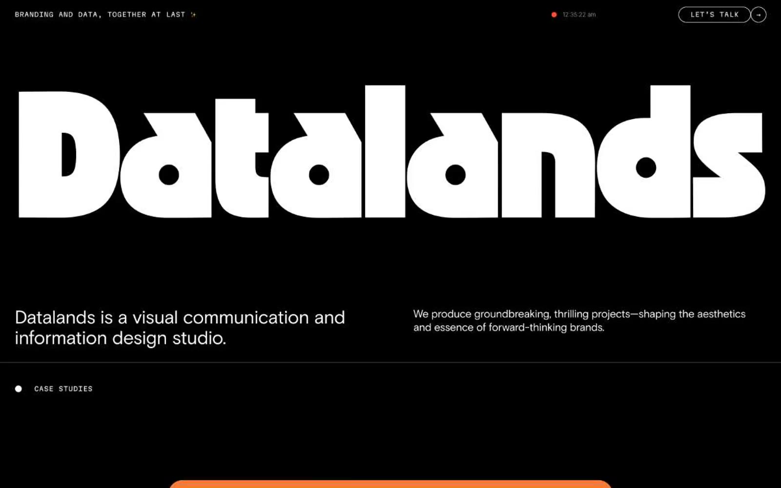
> Black cathedral with a single neon heartbeat. The wordmark fills the nave; everything else is a whispered caption beneath it.

**Theme:** dark

Source measurements are normalized; roles and recommendations are interpreted. Font summary lists are independent, not paired by position. HTML examples are reconstructions, not source components.

Datalands is a monochrome-black studio portfolio built around a single act of typographic spectacle: an OZIK Black wordmark blown to 358px, reducing the entire brand to a shape you feel before you read. The interface is deliberately austere — pure black canvas, white text, Martian Mono for all UI chrome and labels, Basis Grotesque for body copy with aggressive negative tracking. Chromatic color appears only as punctuation: a vivid magenta #fc74dd for the primary action, a small ember-orange #ff4c33 dot ticking in the nav, and case study visuals that erupt with flat geometric color. Everything rounded — inputs, buttons, tags, and the 'LET'S TALK' CTA all use 96px+ radii, creating a soft, almost capsule-like quality that contrasts the brutalist display type. The grid breathes; sections sit 80px apart, cards carry 48px of internal padding, and the dark mode is treated as a content environment, not a surface to be layered.