# Kinfolk — Style Reference
> Editorial broadsheet on bone-white linen — generous margins, ink-black serif, and a single warm-paper accent for section breaks.

**Theme:** light

Source measurements are normalized; roles and recommendations are interpreted. Font summary lists are independent, not paired by position. HTML examples are reconstructions, not source components.

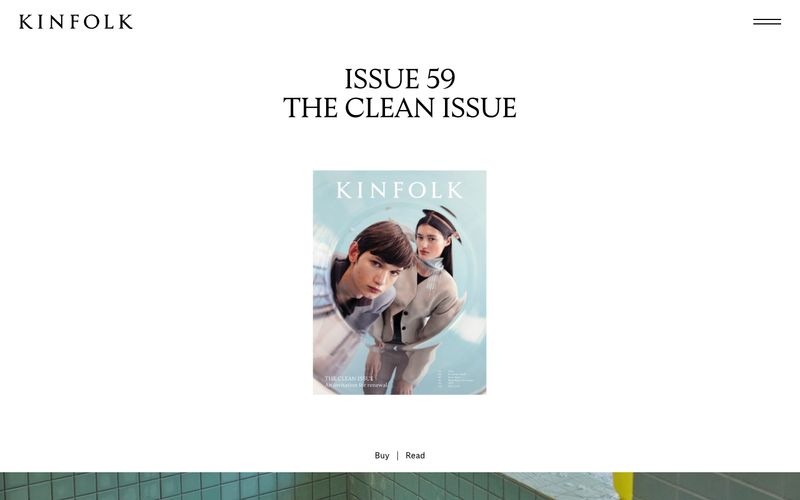
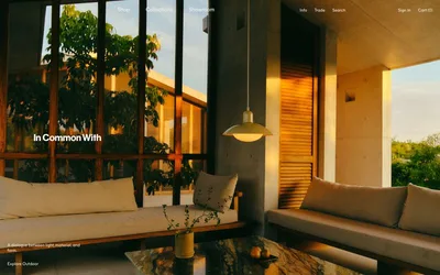
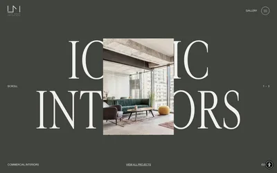
Kinfolk translates a printed art-magazine to the web: bone-white canvases, full-bleed editorial photography, and serif type that does the heavy lifting while the interface stays nearly invisible. The entire palette is monochromatic — black ink on warm off-white paper, with a single warm sage-gray (#dbded5) used as a paper-tinted section break. There are no accent colors, no filled buttons, no decorative gradients; hierarchy is built through typographic scale, whitespace, and the rhythm of image-to-text transitions. Display serif at 50–60px with -0.025em tracking carries the editorial gravitas; a single weight (400) across all families creates a deliberately quiet, consistent voice. The result is less a website than a gallery wall — the photographs and headlines are the exhibits, and the UI is the white wall around them.