# July Fund — Style Reference
> dark gallery monograph with chromatic chapter cards

**Theme:** dark

Source measurements are normalized; roles and recommendations are interpreted. Font summary lists are independent, not paired by position. HTML examples are reconstructions, not source components.

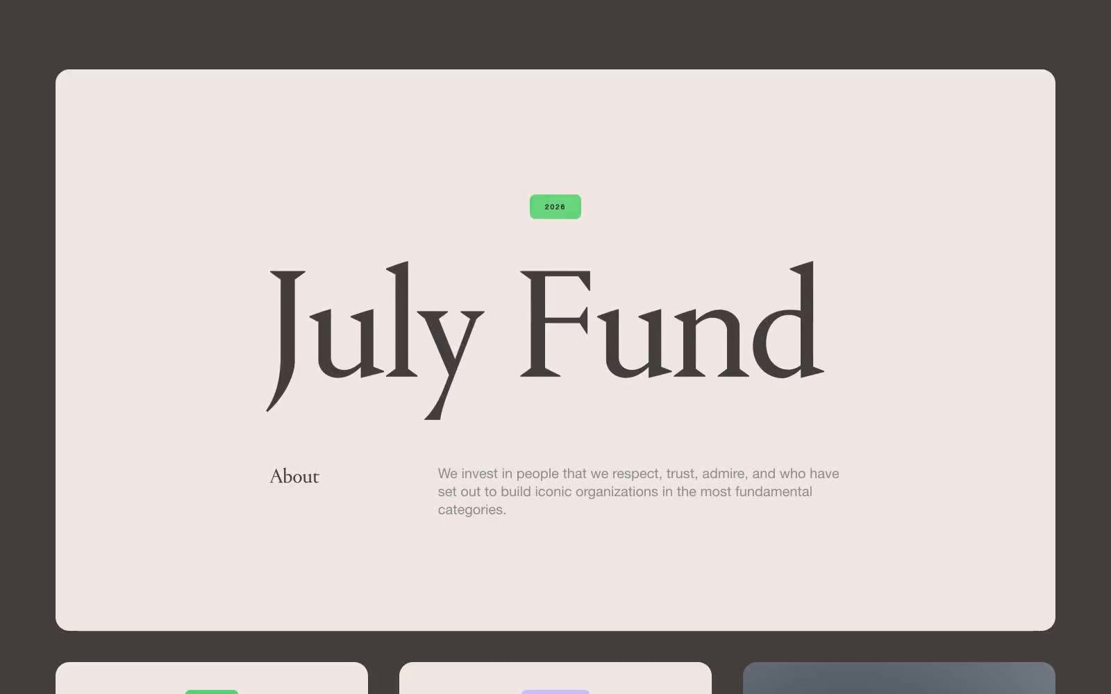
July Fund is an editorial venture-capital mosaic rendered in a dark, museum-like gallery space. The base is near-black (#000000 and #433e3c warm charcoals), and content is built from individual themed cards — each one a saturated color field acting as a chapter in a visual index. Typography is deliberately split: a high-contrast custom serif (Portrait) sets headlines that feel like gallery wall text, while compact Helvetica Neue runs the labels, metadata, and body copy underneath in a quiet, typewriter-precise voice. The system reads as a printed monograph made interactive — generous padding inside cards, pill-shaped controls, uppercase letter-spaced badges, and zero decorative shadow. Color is not decoration here; it is categorization. Each chromatic card (forest green, twilight violet, olive, solar yellow, ember red) signals a different fund vertical or post type, so the grid itself becomes a navigation system.