# Linktr — Style Reference
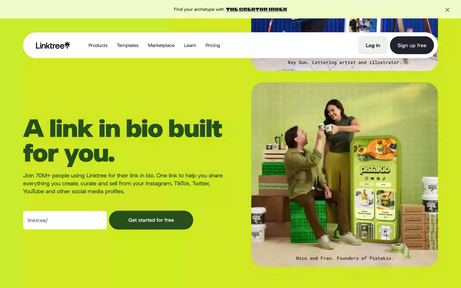
> Editorial posters stacked like candy. A full-bleed color-block site where lime green headlines sit on cobalt blue walls and white pill-shaped navs float across maroon fields.

**Theme:** mixed

Source measurements are normalized; roles and recommendations are interpreted. Font summary lists are independent, not paired by position. HTML examples are reconstructions, not source components.

Linktree speaks in full-volume color blocks: each section is a saturated wall of lime, cobalt, or maroon, and content floats on top as white pills and dark text. The system treats color as the layout, not decoration — headers, cards, and CTAs inherit the section hue rather than fighting it, while a recurring chartreuse green acts as the brand's singular action accent. Typography is a single custom geometric sans (Linksans) set extra-bold with tight negative tracking at display sizes, giving headlines a compressed, poster-like weight. Shapes are aggressively rounded: nav bars and buttons become perfect pills, cards become lozenges, and only form inputs keep a modest 8px corner. The result reads as a series of bold editorial spreads rather than a conventional product page.