# Uniswap — Style Reference
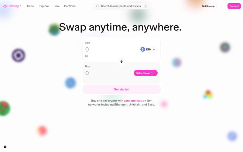
> Pink confetti over a clean white trading desk.

**Theme:** light

Source measurements are normalized; roles and recommendations are interpreted. Font summary lists are independent, not paired by position. HTML examples are reconstructions, not source components.

Uniswap's interface is a bright, mostly flat white canvas interrupted by one saturated hot-pink accent and scattered colorful decorative orbs that give the experience a playful, confetti-like atmosphere. The system deliberately rejects the dark-mode crypto convention in favor of an airy, almost editorial feel where the swap widget sits front-and-center as a quiet white card and the pink (#ff37c7) does all the expressive work — marking the primary action, the brand mark, and the only chromatic decision an interface designer needs to make. Typography is handled by a single custom face (Basel) at unusual mid-weights (485, 535) with tight tracking across all sizes, producing a geometric, slightly clinical tone that keeps the product feeling like a serious financial tool despite the candy-colored hero. Surfaces are nearly shadowless — the only elevation in the system is a barely-visible 10% black blur — and everything is separated by hairline borders and generous whitespace rather than stacked panels. The rainbow of secondary hues (#ff4d00, #2abdff, #00c3a0, #8251fb, etc.) functions as a token/asset taxonomy rather than a UI accent system, meaning most new screens should stay achromatic with pink as the sole chromatic verb.