# Index — Style Reference
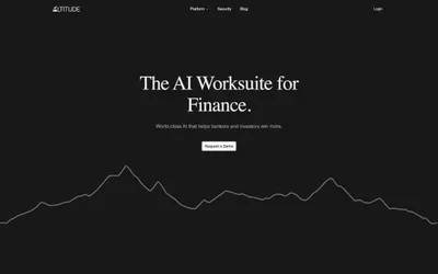
> twilight summit command center — a violet-tinted dark dashboard crowned by a single mountain horizon at dusk, where the only warm light is the coral CTA

**Theme:** dark

Source measurements are normalized; roles and recommendations are interpreted. Font summary lists are independent, not paired by position. HTML examples are reconstructions, not source components.

Index operates as a twilight alpine command center: a near-black canvas tinted with deep indigo and violet, overlaid with high-density product UI and crowned by a single dramatic peak-against-dusk landscape. The system stays nocturnal — backgrounds are violet-shifted blacks (#0c0a2b, #13151f), borders are muted violet hairlines (#292a4d), and text is bone-white (#ffffff) with a graphite secondary (#9b9ba4). The lone warm signal is a coral-to-red gradient (#ff8a76 → #ff3a63) reserved exclusively for the primary CTA — it reads as sunrise breaking the ridge, demanding attention against the cold palette. Inside product surfaces, color is functional punctuation: small saturated dots (electric blue #0067ff, violet #665eff, vivid red #ff3a63, chartreuse #ffff00) mark status, priority, and category. Cards float on the dark canvas with 1px violet borders, no shadows — the surface system relies on luminance steps and border weight, not elevation. Typography is compact, geometric, and slightly tracked-out at small sizes, with a custom 'Index' display face (sizes up to 72px) and Inter for the dense table/UI layer.