# Alison Roman — Style Reference
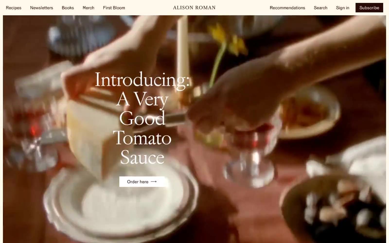
> cookbook pages on warm cream paper — a printed spread from an artisan food memoir, translated to screen with zero loss of tactility

**Theme:** light

Source measurements are normalized; roles and recommendations are interpreted. Font summary lists are independent, not paired by position. HTML examples are reconstructions, not source components.

Alison Roman's site is a warm, editorial cookbook author's atelier — cream-paper canvas, elegant serif typography, and a single near-black warm-brown that carries every text and action. The palette is almost entirely tonal: three creams layered from canvas to card, a whisper-pale yellow for link underlines, and a burgundy flash reserved for book-cover backgrounds. Layout is generous, magazine-paced, and asymmetric — book covers on the left, descriptive copy on the right, with the dark-brown filled 'Order' button as the sole structural punctuation. No shadows, no gradients, no decorative borders; hierarchy is built through type scale, generous whitespace, and the contrast between warm cream and warm black. The design reads like a printed cookbook spread translated faithfully to the web: confident, restrained, and food-warm without ever resorting to food clichés.