# Escape Coffee Company — Style Reference
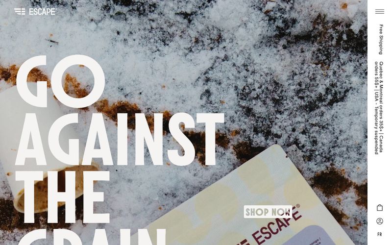
> Frost-bleached editorial broadsheet — large display type cut into warm off-white, all atmosphere carried by raw photography.

**Theme:** light

Source measurements are normalized; roles and recommendations are interpreted. Font summary lists are independent, not paired by position. HTML examples are reconstructions, not source components.

Escape is a monochromatic, editorial system built around weather-worn photography and three custom typefaces that do the heavy lifting. The canvas is a warm off-white (#f5f4f2) rather than pure white, giving every page the feel of a sun-bleached magazine spread rather than a SaaS dashboard. Molitor at 250px carries the emotional weight — oversized, tightly leaded (0.85), and slightly negative-tracked so the type feels cut from stone — while TWK Lausanne at near-light weights (200–300) handles everything functional with the restraint of a printed caption. Color is deliberately absent: the entire palette is warm grays from #ffffff to #151515, and accents arrive only as the texture of the imagery itself (snow, stone, coffee grounds). Components are minimal and geometric: thin borders, no elevation, tiny radii (3–10px), and generous whitespace. The system never decorates — it curates.